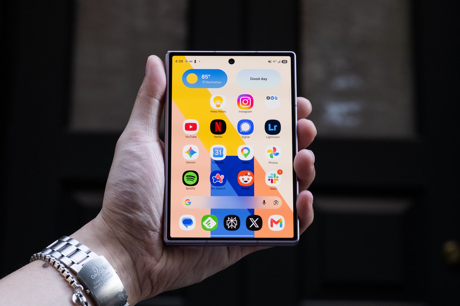
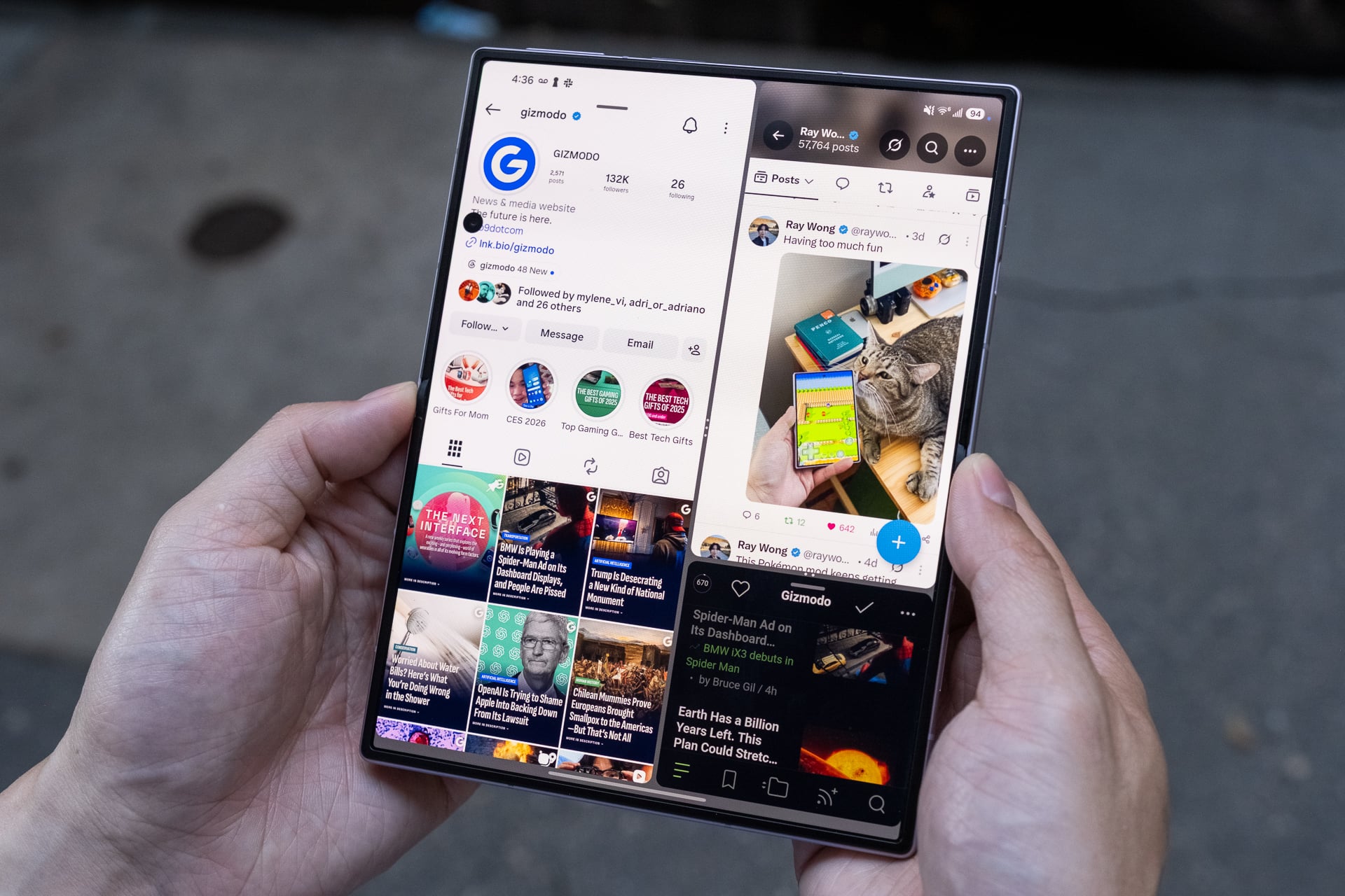
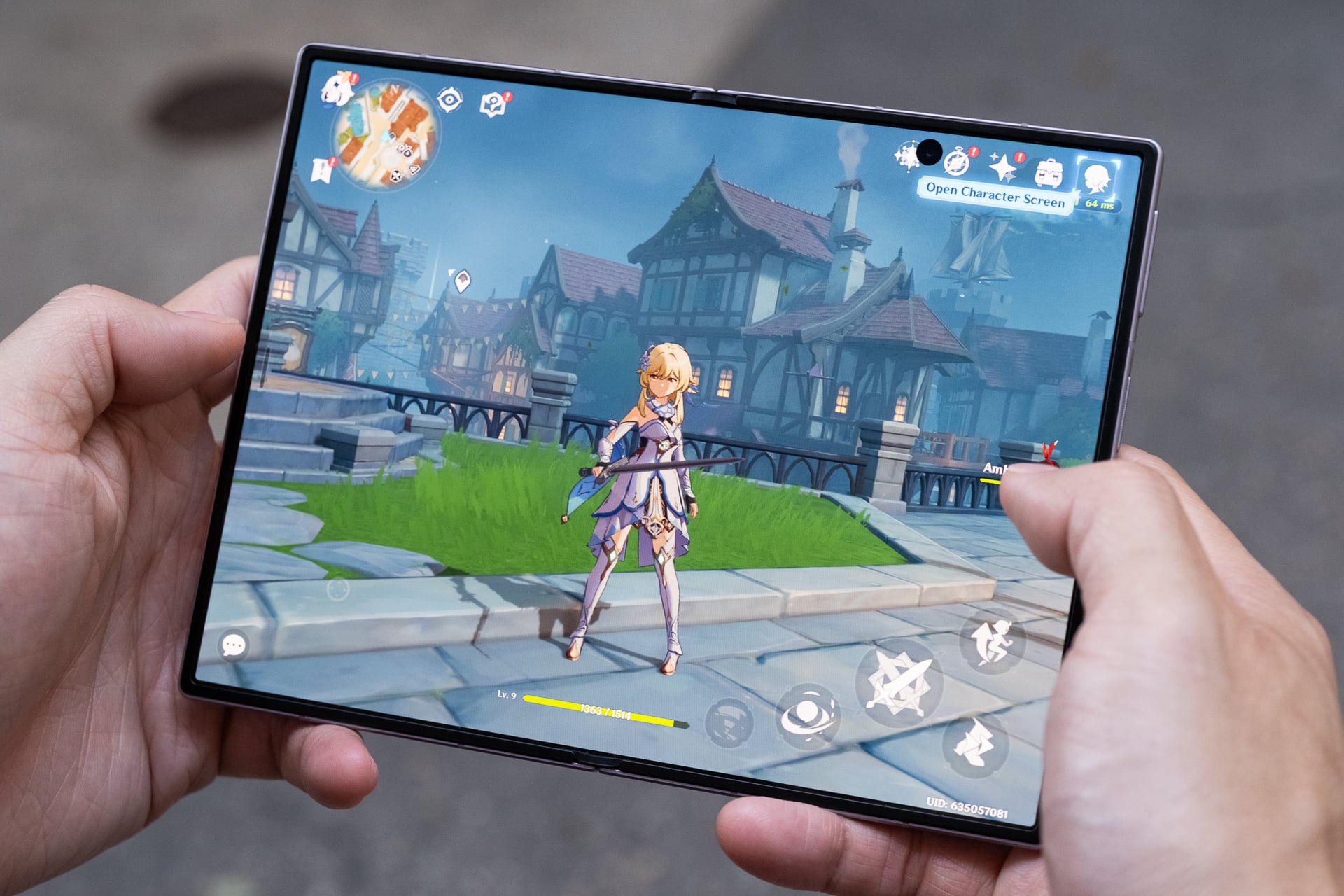
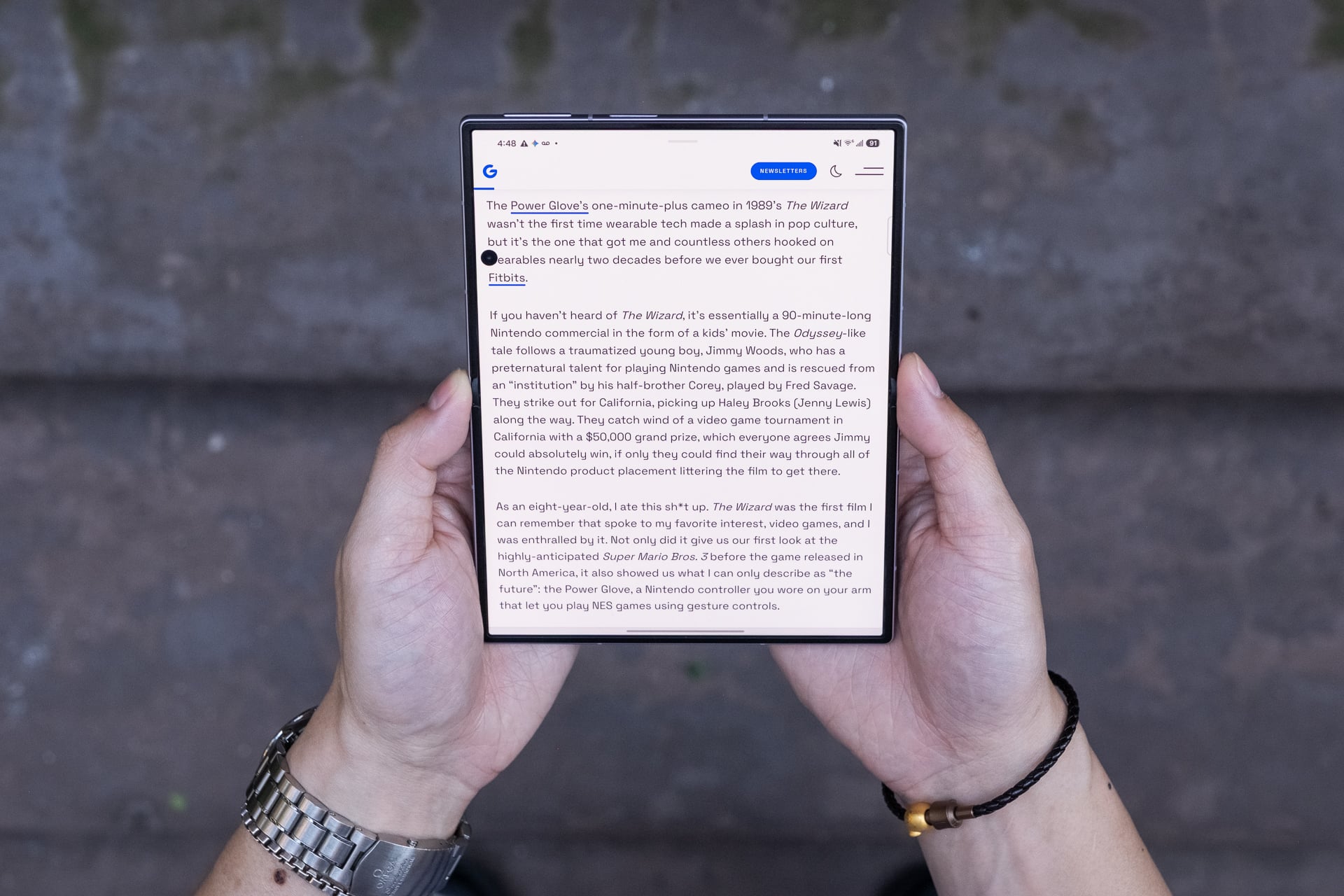
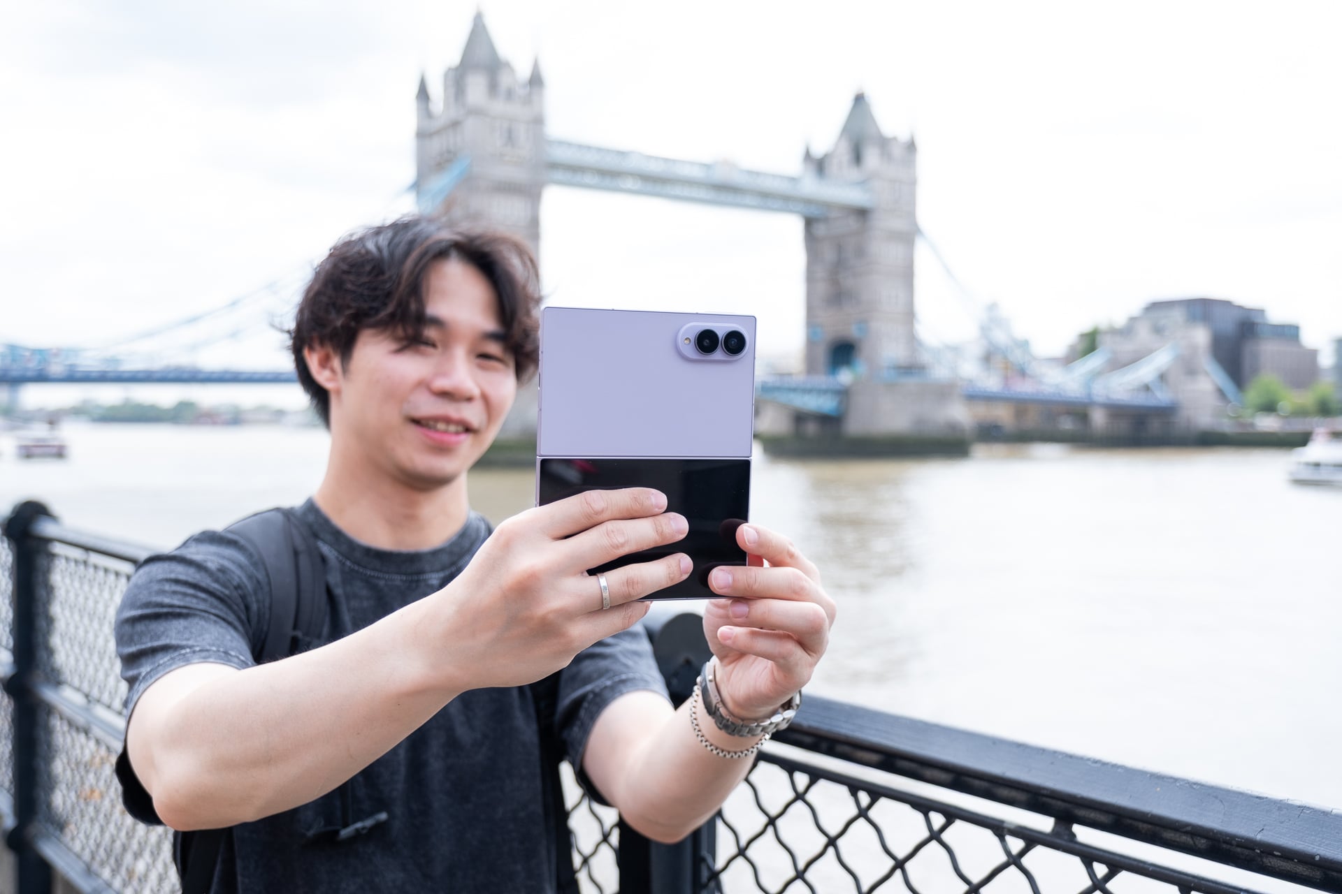
Samsung’s Galaxy Z Fold 8 is the best phone (not just foldable) I’ve ever used for consuming content—watching videos, playing mobile games, reading, and yes, even doomscrolling social media—thanks to its 7.6-inch inner screen.
The book-style foldable phone’s novel shape when closed may look strange at first, but I promise you that its shorter and wider footprint (when closed) quickly feels normal after a few days. The whole point of this form factor is to unfold it for its larger tablet-sized screen, and I can assure you that you’ll be doing that often because the experience encourages it more.
More importantly, the Z Fold 8 has fewer of the compromises that held back Samsung’s previous foldable phones. The device is lighter and easier to unfold, the battery is bigger and lasts all day, and Samsung has greatly reduced the crease on the inner screen.
Some apps still might not display correctly on both screens, but even so, I’m declaring the Z Fold 8 a home run. I can’t stop using it.
Samsung Galaxy Z Fold 8
The Galaxy Z Fold 8 is Samsung’s best version of a book-style foldable phone yet, even with its premium price.
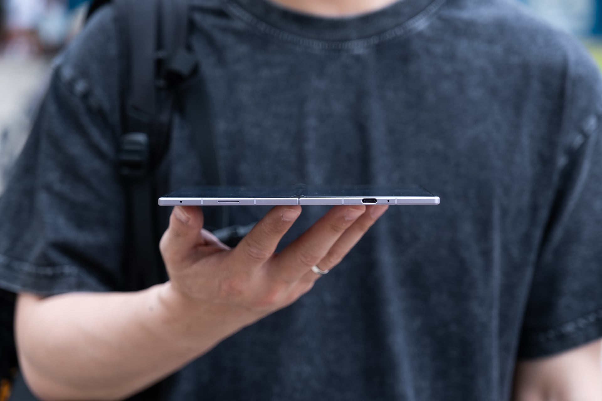
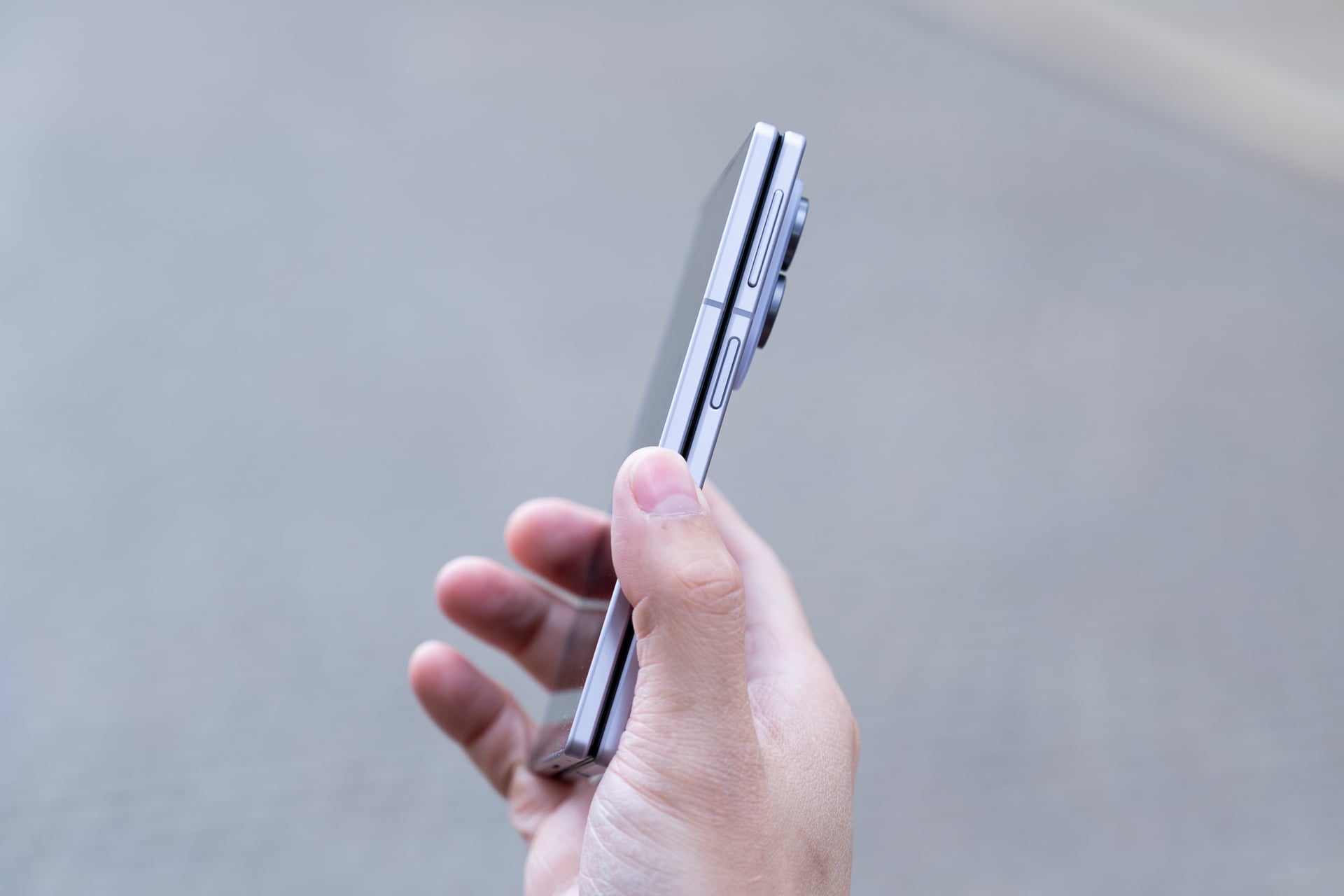
The best size comparisons for the Z Fold 8 are a passport or a B7-sized notebook. The foldable measures 4.88 x 3.24 inches when it’s closed. It’s a few hairs thicker than the Z Fold 8 Ultra, but because of the squatter dimensions and lighter weight, the Z Fold 8 doesn’t feel unwieldy. I’m mostly able to reach corner to corner on the 5.5-inch AMOLED cover screen, something I haven’t been able to do on any “regular” (read: 6 to 6.9-inch) bar-style phone in years.
It also fits in my front pants pockets better than expected; I had concerns that the width might be too wide. I guess if you’re already used to the width of an iPhone 17 Pro Max or a Galaxy S26 Ultra, the Z Fold 8’s only slightly wider.
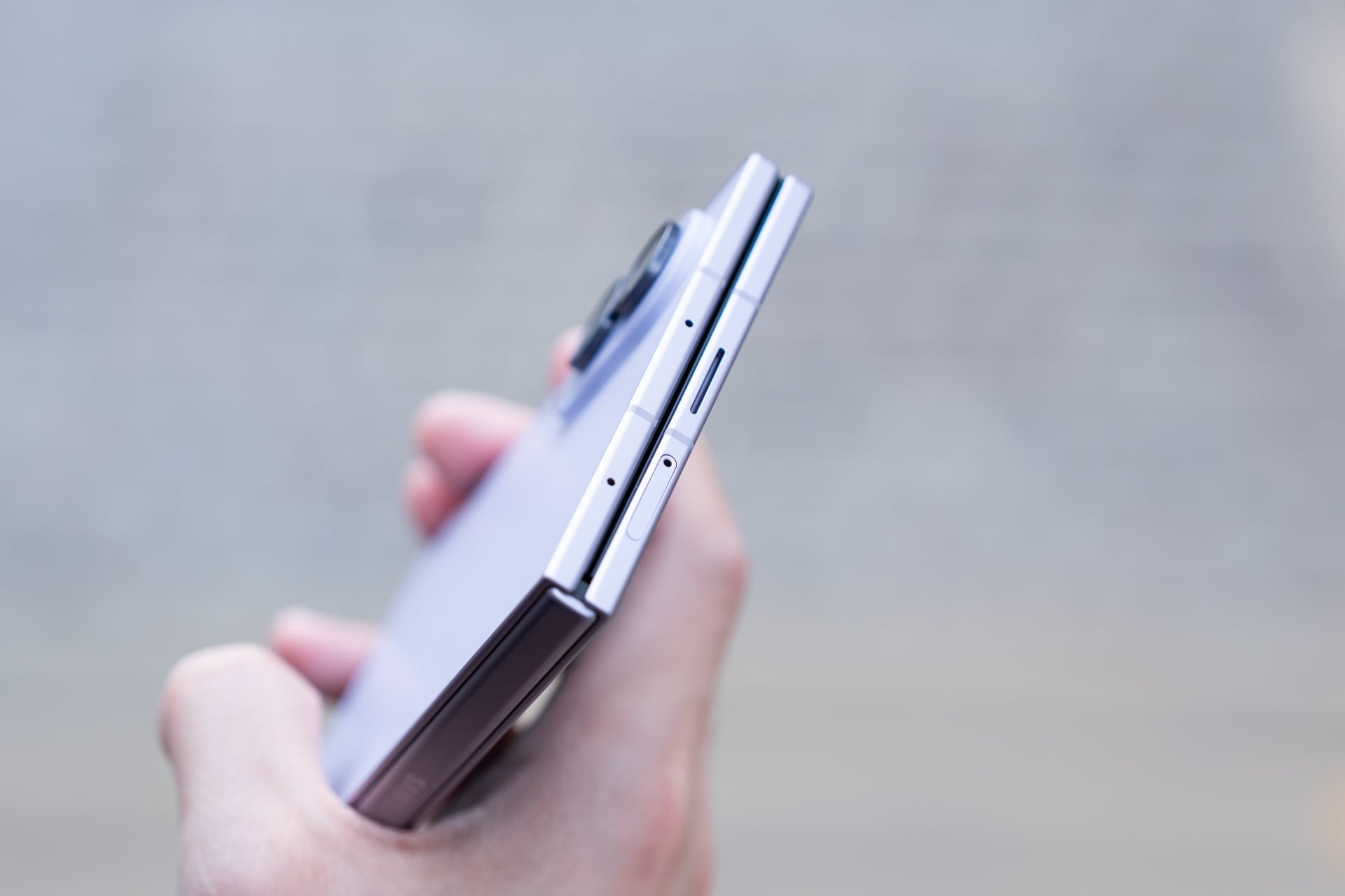
I’m able to reach the power button/fingerprint reader easily with my right thumb. Lefties might struggle since they can’t use their thumb and will have to register their index finger, which might be a little stretch to press the button, like it is for me. The volume rocker is a little high for me; I prefer its lower position on the Z Fold 7/Z Fold 8 Ultra. Typing with two hands on the cover screen is a much easier affair than on narrower phones; I made fewer typos compared to my iPhone. One-handed typing will depend on whether your hand is large enough and your thumb can stretch across the keyboard.
The 10:16 aspect ratio of the cover screen is also not as cramped as it seems. You lose vertical space compared to most regular phones and taller foldables like the Z Fold 8 Ultra, which means apps will show less and you’ll need to scroll more, but that’s mostly a non-issue if you open the phone and rotate it to vertical orientation. I never found myself bothered that I couldn’t see enough on the cover screen. If anything, I appreciated the shorter screen more because I didn’t feel compelled to pull it out as much unless I wanted to unfold it.
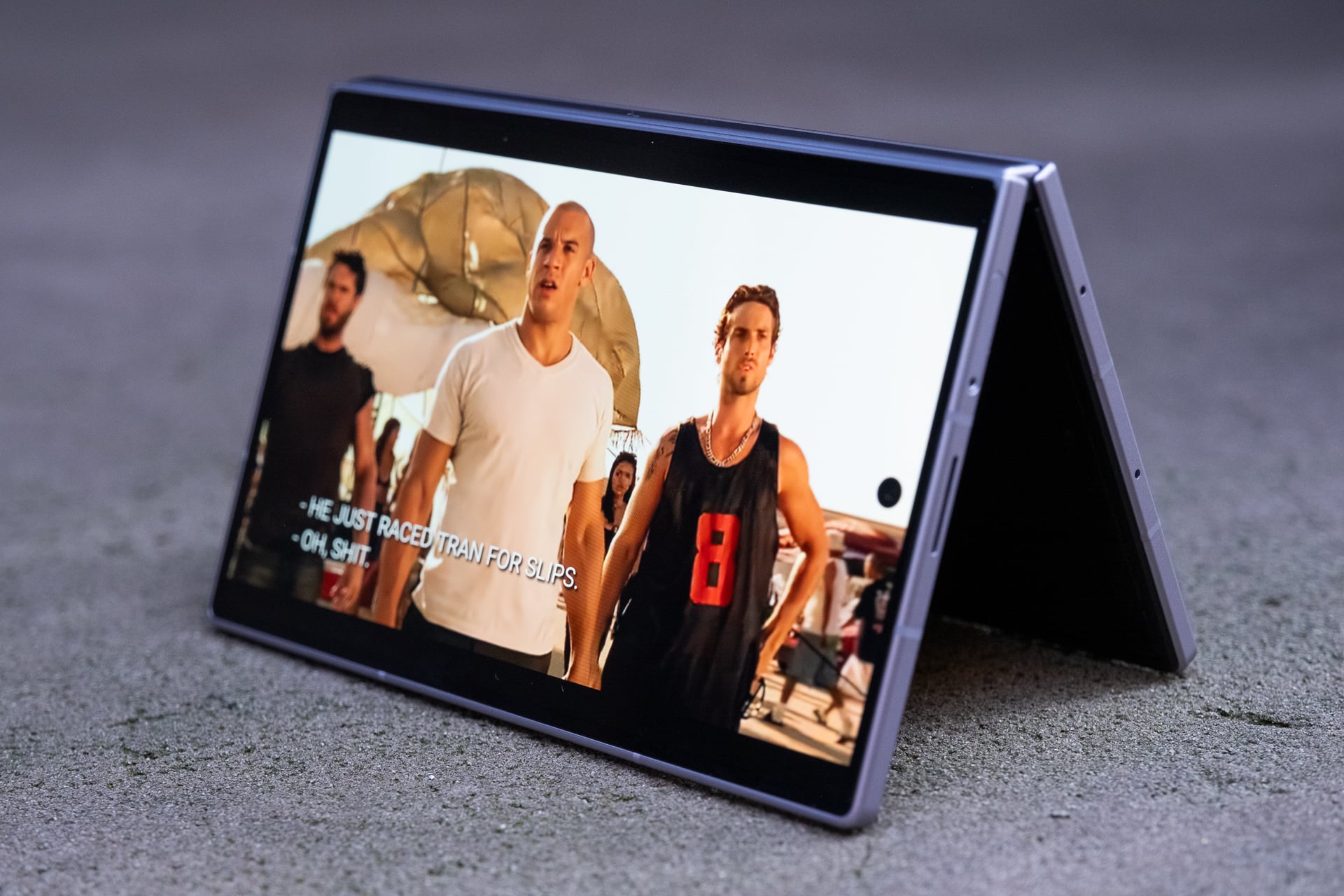
Like on the Z Fold 8 Ultra, you can use the Z Fold 8 in “tent” mode. This is great for propping up the device on a plane tray table or if you’re just too lazy to hold it up while in bed. I fly a lot for work, so tent mode is something I find very useful. A Z Fold 8 Ultra feature that you won’t find on the Z Fold 8 is “Flex mode.” On the Z Fold 8 Ultra, you can snap the screen so that it resembles a baby laptop, and some apps, like YouTube, will display the video above the crease and controls below it. I never found much utility for Flex mode on the previous Z Folds and I don’t miss it on the Z Fold 8. If that’s something you care about, get the Z Fold 8 Ultra instead.
Out of all the book-style foldable phones I’ve tested over the past seven years, the Z Fold 8 is the only one that I have unfolded more times than I have not. With each generation of Z Fold, Samsung made the dimensions more like a regular bar-style phone. I heaped praise on the Z Fold 7 for finally ditching the previous skinny, remote-like shape. And even though I considered the Z Fold 7 my favorite Android phone of 2025, I realized that I only used its inner screen maybe less than 50% of the time I pulled it out. With the cover screen being normal-sized, there just wasn’t as much of a need to unfold it for the 8-inch screen.
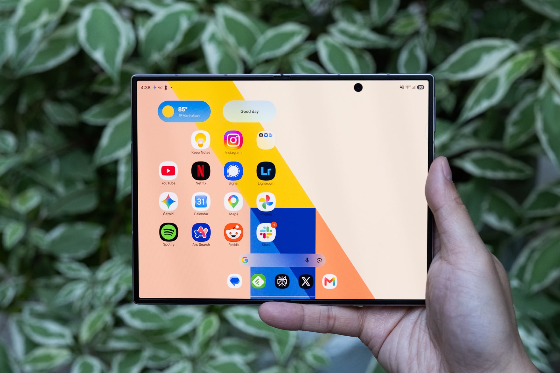
That hasn’t been the case with the Z Fold 8. Because of the shorter cover screen, I almost always unfold it to use the larger display. Maybe that’s because the Flex Titanium technology helps the hinge spring open better or the beveled aluminum frame makes it easier to unfold without needing fingernails, or both. Whatever the reasons are, it’s easier to see and feel the benefits of the larger size of the inner screen’s 4:3 aspect ratio for most content than on a more square-ish folding screen like the Z Fold 8 Ultra’s. To get roughly the same diagonal screen for widescreen videos on the Z Fold 8 Ultra, you need to rotate it, which is an extra step. It’s a tiny bit of friction that makes the task of quickly unfolding and getting more screen real estate less convenient. When you’re unfolding the phone dozens of times a day, that one extra step adds up.
After two weeks of using the Z Fold 8 and Z Fold 8 Ultra, I’ve concluded that if you watch more videos and game more than you read, the Z Fold 8 is the better foldable since you won’t need to rotate it so much. If you do more reading and split-screen multitasking, the Z Fold 8 Ultra is more suitable since you’ll get more vertical display on both the cover and inner screens without rotating, and you’ll do less scrolling.
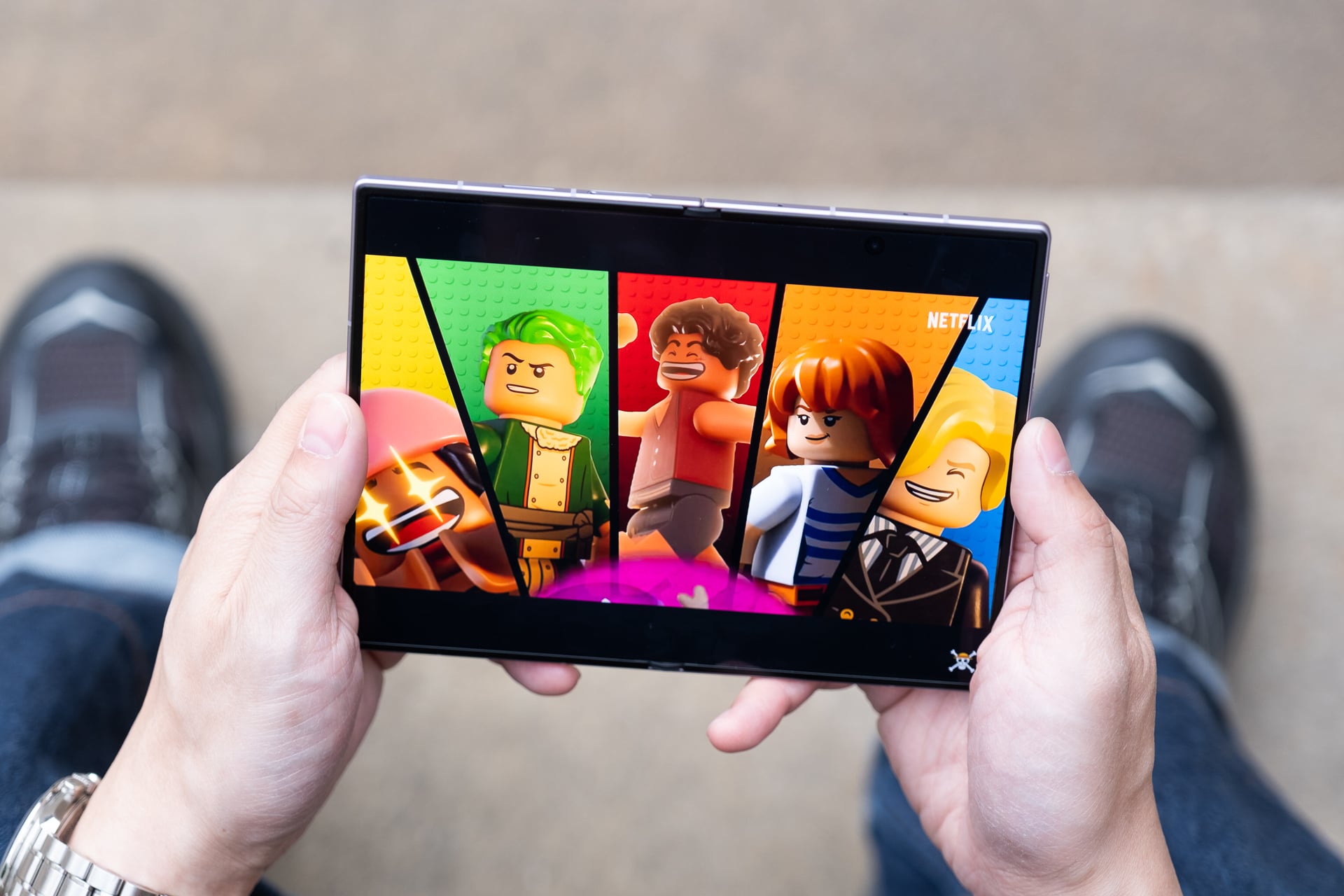
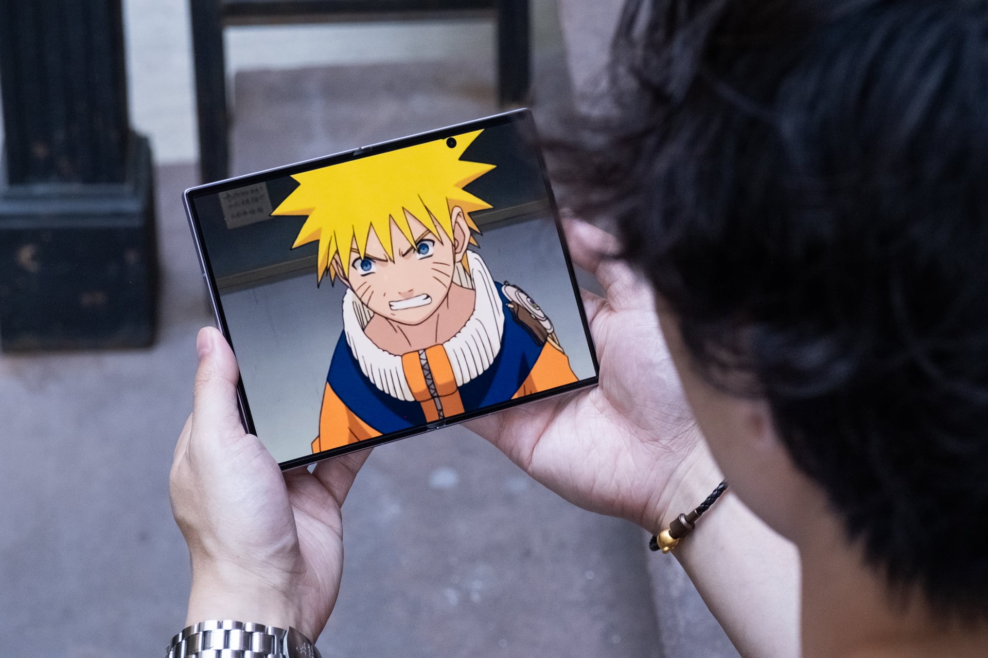
I consume a ridiculous amount of content on a daily basis, so I find the 4:3 aspect ratio more versatile for my needs. In just two weeks, I watched, gamed, and read more on the Z Fold 8 than I have on any new phone I’ve ever tested. Videos look incredible on the 7.6-inch inner screen; 16:9 videos have minimal letterboxing (black bars) above and below them, and old content like many original anime series in 4:3 aspect ratio fill up the entire screen. I’ve never felt more informed and entertained from my phone.
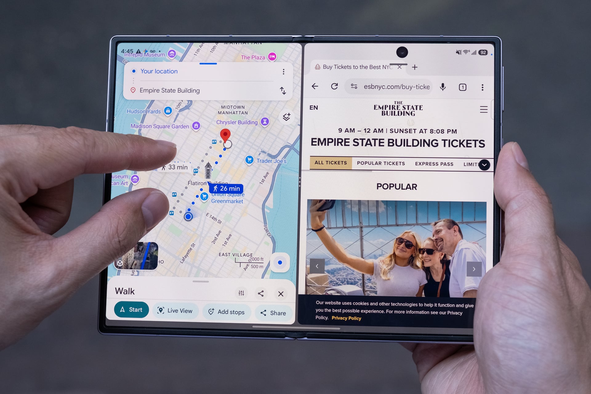
As with the Z Fold 8 Ultra, the Z Fold 8 lets you run three apps in split-screen layouts or four (with a pop-up) on the inner screen. I wouldn’t recommend running more than two apps side by side in landscape orientation. Three apps side by side make each app window very skinny, and one app on one side and two stacked on the other half feel squished. Split-screen apps in vertical orientation just look too long to be useful in most cases. In some split-screen layouts, Samsung’s One UI 9 does let you tap between split-screen apps to have it fill more or most of the screen, but it’s not a function that’s easy to discover.
Performance from the Qualcomm Snapdragon 8 Elite Gen 5 for Galaxy chip is snappy and the 12GB of RAM on my 256GB review unit (you’ll get 16GB if you buy the 1TB model) never chugged when I threw Gemini and Galaxy AI tasks at it. The only thing that occasionally bugs me is that the Z Fold 8 gets toasty even when I’m not doing anything power-hungry. I suspect the super-thin design doesn’t leave much room for adequate thermals; there’s no vapor chamber for cooling like there is on the Galaxy S26 Ultra and iPhone 17 Pro.
The inner screen has been a joy to use, especially on my 1-hour subway commute to and from work. And instead of reaching for my iPad mini in bed, the Z Fold 8 now fills the role instead. It’s great only having to charge one device.
On the topic of charging, the Z Fold 8’s battery is rock solid, lasting me a full day even with heavy use of the inner screen. That’s not surprising since Samsung added a small percentage of silicon carbon into the 4,800mAh battery, which allows for the larger cell while maintaining a slim size. The 45W fast wired charging, with a compatible charger sold separately (of course), was more than quick enough to give me a recharge (around 0% to 65% in 30 minutes) whenever I was low on power. The Z Fold 8 also supports fast wireless charging at 20W, but I used it less compared to other phones like the iPhone 17 Pro or Pixel 10 Pro because Samsung still refuses to include built-in magnetic charging rings. You, again, need to buy a case with magnets to align the phone effortlessly with a Qi2 charger.
The only blemish, literally, on the larger screen experience is the 10-megapixel hole-punch camera on the inner screen. It can obscure essential parts of a menu, buttons, or text depending on what you’re looking at. For example, in Asphalt Legends, I couldn’t see a menu button that the hole punch covered. The hole punch is most noticeable when reading long blocks of text or black and white manga. It makes more sense to put the camera in the corner since it can’t fit in a bezel like on a regular tablet.
Other than that, I might nitpick the placement of the two stereo speakers. They’re located on the top and bottom of the cover screen, which makes them left-side oriented when the Z Fold 8 is unfolded. The speakers get loud enough, but because they’re both on the left in tablet mode, it almost sounds mono coming from one side. To be clear, these are stereo speakers. I get why Samsung might have designed it like this: the speakers fire out of the left and right in tent mode. Maybe put one speaker on each side for a balanced sound when it’s unfolded?
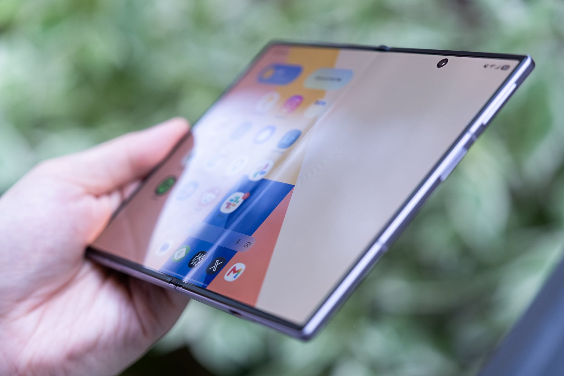
As for the crease… It’s less visible for sure, but hasn’t been completely eliminated. Fresh out of the box, the inner screen is pristine and crease-free. Two weeks in, the crease has deepened with hundreds of folds and I can see it when the screen is off, but it doesn’t warp as much as it did on past Samsung foldables. I almost never notice it when I’m watching videos, gaming, or reading. Besides the reinforced titanium alloy film on top of the screen and the titanium plate underneath it to ensure it stays flatter to the touch over time, Samsung also added an anti-reflective layer to reduce glare, and it really does help. I’ve said it before and I’ll say it again: the crease may never be fully eliminated from folding screens. The best we can hope for may just be making it less visible.
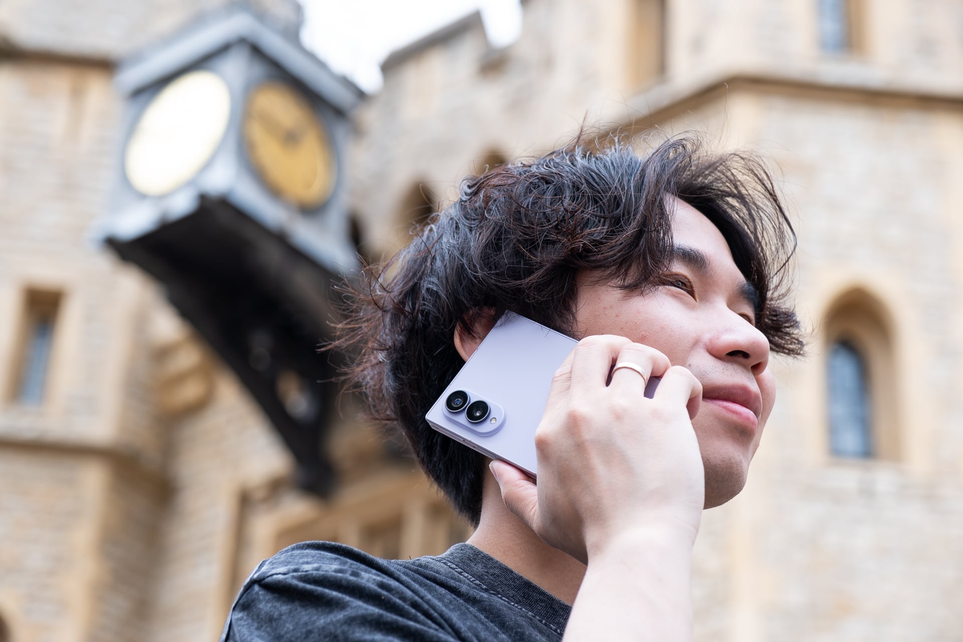
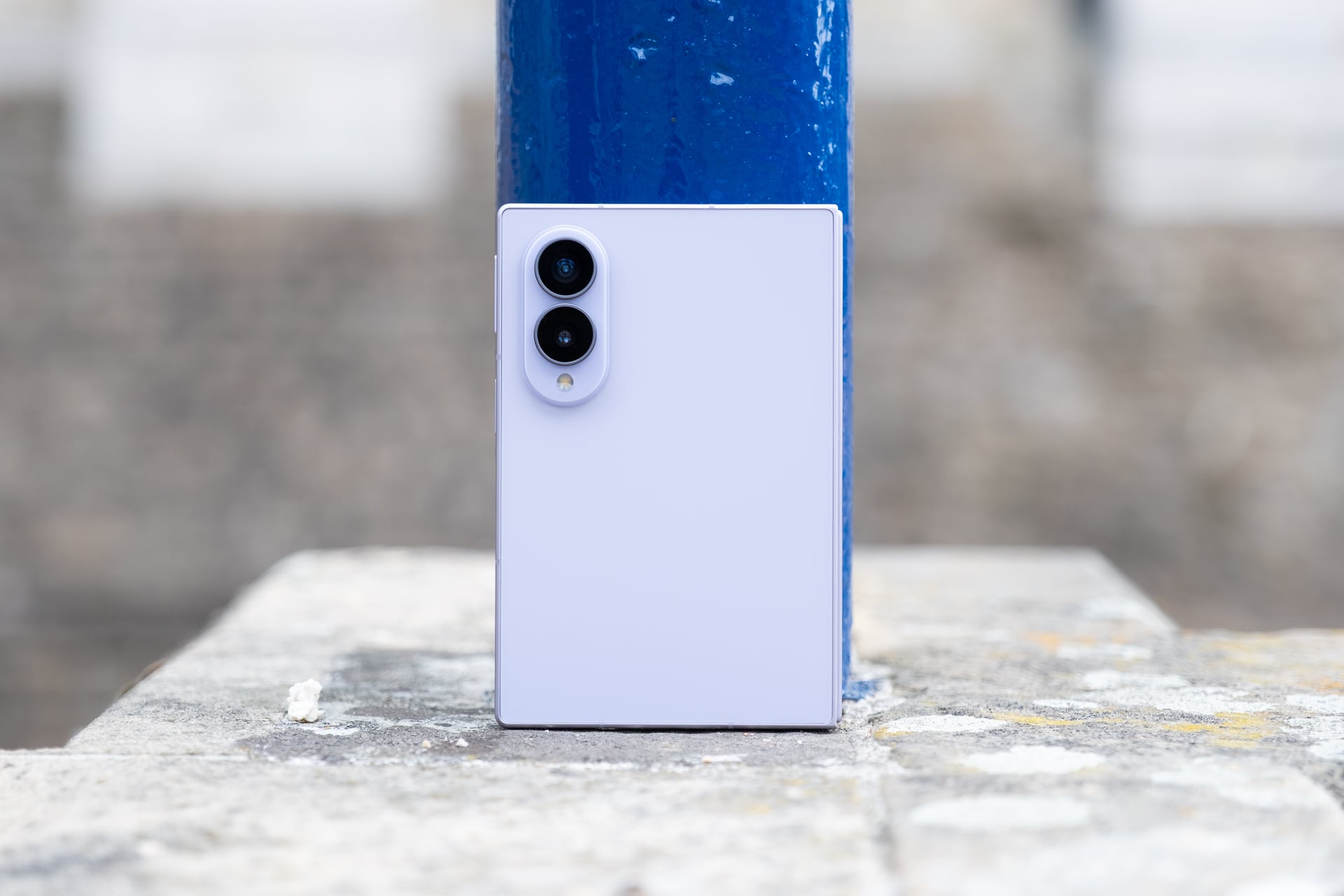
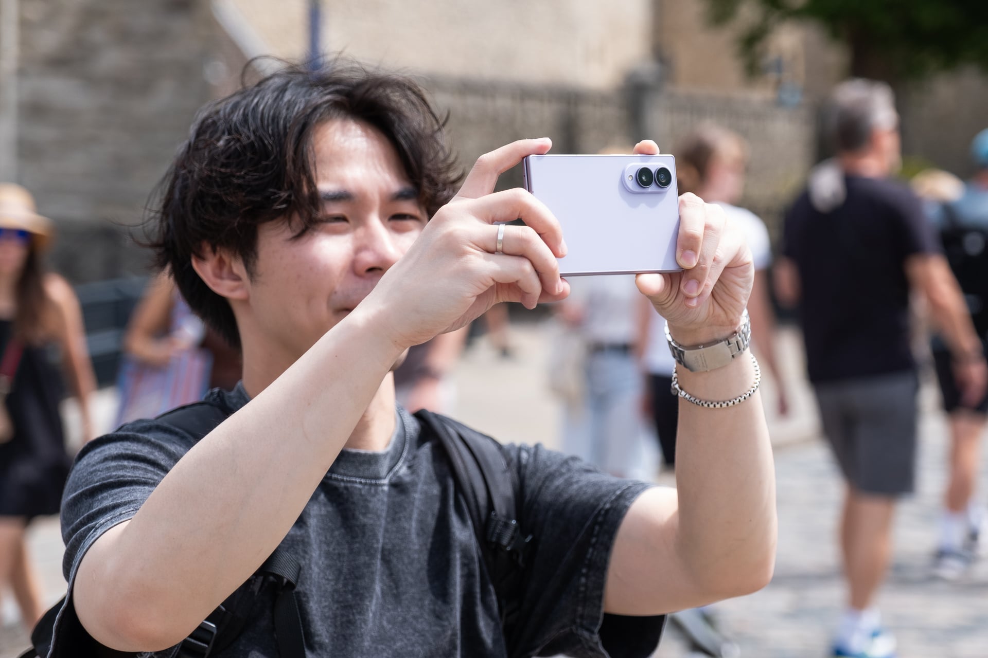
Depending on what you consider the Z Fold 8, either as the sequel to the Z Fold 7 or as a new class of foldables, the cameras will impress or disappoint. If viewed as a Z Fold 7 successor, the 50-megapixel main camera may feel like a downgrade from the previous 200-megapixel shooter. The 50-megapixel ultrawide on the Z Fold 8 will, however, be an upgrade from the Z Fold 7’s 12-megapixel one. You may also be upset it doesn’t have a telephoto lens.
If you want triple rear cameras and more resolution for the main camera, Samsung sells the Z Fold 8 Ultra. I have no complaints with the dual 50-megapixel rear cameras and dual 10-megapixel hole-punch cameras on the Z Fold 8. I don’t think most people will care there’s no telephoto. You still get a 2x zoom that crops in on the 50-megapixel sensor and looks nearly optical-quality to me. This is similar to the virtual 2x “telephoto” that you’ll find on other phones and all recent iPhones that have larger main sensors. The 4x and 10x zooms on the Z Fold 8 are digital, though, and the fuzzier image quality shows.
For everyday photos and videos, the Z Fold 8 cameras are good enough. Image quality looks vibrant and not overly saturated like it used to on Samsung phones and I think the HDR looks less processed compared to iPhone photos. Low-light shots look solid, too. If you’re the type of person who doesn’t want to spend too much or any time editing your photos, the Z Fold 8 photos are more than fine to post directly to social media.
The Z Fold 8 is loaded with a bunch of AI editing features, like “Photo Assist,” which lets you describe an edit with text; “My FanCam,” which lets you motion-track a subject in a video and then crop it for different aspect ratios for posting to social media; and a “Scan” feature that can clean up photos of documents (i.e. sharpen text, flatten and fix the geometry, and remove folded corners or fingers). These can be useful, but there already are apps that exist that do these things. I suppose it’s nice they’re free and built-in.
I also don’t hate any of the new video recording features, like the dual recording mode that lets you record from both the front and rear cameras simultaneously in various layouts (side by side, split top and bottom, and picture in picture) and super steady recording with horizon lock, which keeps the horizon line straight. Again, none are particularly special, but it’s nice that they’re there when you might need them.
It didn’t take long for me to fall in love with the Galaxy Z Fold 8. That’s just not something that happens often anymore. But fall in love with Samsung’s new foldable—I did. The Z Fold 8 is proof that great hardware still matters—and matters more than simply shoving in more AI features.
I like it more than the Z Fold 7 and the Z Fold 8 Ultra, mainly because its 4:3 inner screen makes consuming content a better and more fun experience than swiping on a long bar. One UI 9 is a very polished Android experience, and a feature like Quick Share, which lets you AirDrop files to Apple devices, is a game-changer. Anything that makes an Android phone work with Apple devices is a big plus to me.
There are still some minor things that people will find fault with, like the fact that Samsung has stuck with an IP48 rating for dust and water resistance instead of bumping that up higher to IP68 like Google did with the Pixel 10 Pro Fold or that Samsung didn’t bring back S Pen support. Neither omission makes the Z Fold 8 feel insufficient in my book. I’m not exposing the Z Fold 8 to harsh conditions and I have no attachment to a stylus.
Look, I get it: the Z Fold 8 is still expensive starting at $1,900. I don’t foresee the price of it coming down anytime soon. Samsung’s stuck to around $2,000 for its book-style foldables since the original Galaxy Fold. If you can justify the value of a larger screen experience, the Z Fold 8 is amazing in almost every aspect.
Samsung’s Galaxy Z Fold 8 is the best phone (not just foldable) I’ve ever used for consuming content—watching videos, playing mobile games, reading, and yes, even doomscrolling social media—thanks to its 7.6-inch inner screen.
The book-style foldable phone’s novel shape when closed may look strange at first, but I promise you that its shorter and wider footprint (when closed) quickly feels normal after a few days. The whole point of this form factor is to unfold it for its larger tablet-sized screen, and I can assure you that you’ll be doing that often because the experience encourages it more.
More importantly, the Z Fold 8 has fewer of the compromises that held back Samsung’s previous foldable phones. The device is lighter and easier to unfold, the battery is bigger and lasts all day, and Samsung has greatly reduced the crease on the inner screen.
Some apps still might not display correctly on both screens, but even so, I’m declaring the Z Fold 8 a home run. I can’t stop using it.
Samsung Galaxy Z Fold 8
The Galaxy Z Fold 8 is Samsung’s best version of a book-style foldable phone yet, even with its premium price.
The best size comparisons for the Z Fold 8 are a passport or a B7-sized notebook. The foldable measures 4.88 x 3.24 inches when it’s closed. It’s a few hairs thicker than the Z Fold 8 Ultra, but because of the squatter dimensions and lighter weight, the Z Fold 8 doesn’t feel unwieldy. I’m mostly able to reach corner to corner on the 5.5-inch AMOLED cover screen, something I haven’t been able to do on any “regular” (read: 6 to 6.9-inch) bar-style phone in years.
It also fits in my front pants pockets better than expected; I had concerns that the width might be too wide. I guess if you’re already used to the width of an iPhone 17 Pro Max or a Galaxy S26 Ultra, the Z Fold 8’s only slightly wider.
I’m able to reach the power button/fingerprint reader easily with my right thumb. Lefties might struggle since they can’t use their thumb and will have to register their index finger, which might be a little stretch to press the button, like it is for me. The volume rocker is a little high for me; I prefer its lower position on the Z Fold 7/Z Fold 8 Ultra. Typing with two hands on the cover screen is a much easier affair than on narrower phones; I made fewer typos compared to my iPhone. One-handed typing will depend on whether your hand is large enough and your thumb can stretch across the keyboard.
The 10:16 aspect ratio of the cover screen is also not as cramped as it seems. You lose vertical space compared to most regular phones and taller foldables like the Z Fold 8 Ultra, which means apps will show less and you’ll need to scroll more, but that’s mostly a non-issue if you open the phone and rotate it to vertical orientation. I never found myself bothered that I couldn’t see enough on the cover screen. If anything, I appreciated the shorter screen more because I didn’t feel compelled to pull it out as much unless I wanted to unfold it.
Like on the Z Fold 8 Ultra, you can use the Z Fold 8 in “tent” mode. This is great for propping up the device on a plane tray table or if you’re just too lazy to hold it up while in bed. I fly a lot for work, so tent mode is something I find very useful. A Z Fold 8 Ultra feature that you won’t find on the Z Fold 8 is “Flex mode.” On the Z Fold 8 Ultra, you can snap the screen so that it resembles a baby laptop, and some apps, like YouTube, will display the video above the crease and controls below it. I never found much utility for Flex mode on the previous Z Folds and I don’t miss it on the Z Fold 8. If that’s something you care about, get the Z Fold 8 Ultra instead.
Out of all the book-style foldable phones I’ve tested over the past seven years, the Z Fold 8 is the only one that I have unfolded more times than I have not. With each generation of Z Fold, Samsung made the dimensions more like a regular bar-style phone. I heaped praise on the Z Fold 7 for finally ditching the previous skinny, remote-like shape. And even though I considered the Z Fold 7 my favorite Android phone of 2025, I realized that I only used its inner screen maybe less than 50% of the time I pulled it out. With the cover screen being normal-sized, there just wasn’t as much of a need to unfold it for the 8-inch screen.
That hasn’t been the case with the Z Fold 8. Because of the shorter cover screen, I almost always unfold it to use the larger display. Maybe that’s because the Flex Titanium technology helps the hinge spring open better or the beveled aluminum frame makes it easier to unfold without needing fingernails, or both. Whatever the reasons are, it’s easier to see and feel the benefits of the larger size of the inner screen’s 4:3 aspect ratio for most content than on a more square-ish folding screen like the Z Fold 8 Ultra’s. To get roughly the same diagonal screen for widescreen videos on the Z Fold 8 Ultra, you need to rotate it, which is an extra step. It’s a tiny bit of friction that makes the task of quickly unfolding and getting more screen real estate less convenient. When you’re unfolding the phone dozens of times a day, that one extra step adds up.
After two weeks of using the Z Fold 8 and Z Fold 8 Ultra, I’ve concluded that if you watch more videos and game more than you read, the Z Fold 8 is the better foldable since you won’t need to rotate it so much. If you do more reading and split-screen multitasking, the Z Fold 8 Ultra is more suitable since you’ll get more vertical display on both the cover and inner screens without rotating, and you’ll do less scrolling.
I consume a ridiculous amount of content on a daily basis, so I find the 4:3 aspect ratio more versatile for my needs. In just two weeks, I watched, gamed, and read more on the Z Fold 8 than I have on any new phone I’ve ever tested. Videos look incredible on the 7.6-inch inner screen; 16:9 videos have minimal letterboxing (black bars) above and below them, and old content like many original anime series in 4:3 aspect ratio fill up the entire screen. I’ve never felt more informed and entertained from my phone.
As with the Z Fold 8 Ultra, the Z Fold 8 lets you run three apps in split-screen layouts or four (with a pop-up) on the inner screen. I wouldn’t recommend running more than two apps side by side in landscape orientation. Three apps side by side make each app window very skinny, and one app on one side and two stacked on the other half feel squished. Split-screen apps in vertical orientation just look too long to be useful in most cases. In some split-screen layouts, Samsung’s One UI 9 does let you tap between split-screen apps to have it fill more or most of the screen, but it’s not a function that’s easy to discover.
Performance from the Qualcomm Snapdragon 8 Elite Gen 5 for Galaxy chip is snappy and the 12GB of RAM on my 256GB review unit (you’ll get 16GB if you buy the 1TB model) never chugged when I threw Gemini and Galaxy AI tasks at it. The only thing that occasionally bugs me is that the Z Fold 8 gets toasty even when I’m not doing anything power-hungry. I suspect the super-thin design doesn’t leave much room for adequate thermals; there’s no vapor chamber for cooling like there is on the Galaxy S26 Ultra and iPhone 17 Pro.
The inner screen has been a joy to use, especially on my 1-hour subway commute to and from work. And instead of reaching for my iPad mini in bed, the Z Fold 8 now fills the role instead. It’s great only having to charge one device.
On the topic of charging, the Z Fold 8’s battery is rock solid, lasting me a full day even with heavy use of the inner screen. That’s not surprising since Samsung added a small percentage of silicon carbon into the 4,800mAh battery, which allows for the larger cell while maintaining a slim size. The 45W fast wired charging, with a compatible charger sold separately (of course), was more than quick enough to give me a recharge (around 0% to 65% in 30 minutes) whenever I was low on power. The Z Fold 8 also supports fast wireless charging at 20W, but I used it less compared to other phones like the iPhone 17 Pro or Pixel 10 Pro because Samsung still refuses to include built-in magnetic charging rings. You, again, need to buy a case with magnets to align the phone effortlessly with a Qi2 charger.
The only blemish, literally, on the larger screen experience is the 10-megapixel hole-punch camera on the inner screen. It can obscure essential parts of a menu, buttons, or text depending on what you’re looking at. For example, in Asphalt Legends, I couldn’t see a menu button that the hole punch covered. The hole punch is most noticeable when reading long blocks of text or black and white manga. It makes more sense to put the camera in the corner since it can’t fit in a bezel like on a regular tablet.
Other than that, I might nitpick the placement of the two stereo speakers. They’re located on the top and bottom of the cover screen, which makes them left-side oriented when the Z Fold 8 is unfolded. The speakers get loud enough, but because they’re both on the left in tablet mode, it almost sounds mono coming from one side. To be clear, these are stereo speakers. I get why Samsung might have designed it like this: the speakers fire out of the left and right in tent mode. Maybe put one speaker on each side for a balanced sound when it’s unfolded?
As for the crease… It’s less visible for sure, but hasn’t been completely eliminated. Fresh out of the box, the inner screen is pristine and crease-free. Two weeks in, the crease has deepened with hundreds of folds and I can see it when the screen is off, but it doesn’t warp as much as it did on past Samsung foldables. I almost never notice it when I’m watching videos, gaming, or reading. Besides the reinforced titanium alloy film on top of the screen and the titanium plate underneath it to ensure it stays flatter to the touch over time, Samsung also added an anti-reflective layer to reduce glare, and it really does help. I’ve said it before and I’ll say it again: the crease may never be fully eliminated from folding screens. The best we can hope for may just be making it less visible.
Depending on what you consider the Z Fold 8, either as the sequel to the Z Fold 7 or as a new class of foldables, the cameras will impress or disappoint. If viewed as a Z Fold 7 successor, the 50-megapixel main camera may feel like a downgrade from the previous 200-megapixel shooter. The 50-megapixel ultrawide on the Z Fold 8 will, however, be an upgrade from the Z Fold 7’s 12-megapixel one. You may also be upset it doesn’t have a telephoto lens.
If you want triple rear cameras and more resolution for the main camera, Samsung sells the Z Fold 8 Ultra. I have no complaints with the dual 50-megapixel rear cameras and dual 10-megapixel hole-punch cameras on the Z Fold 8. I don’t think most people will care there’s no telephoto. You still get a 2x zoom that crops in on the 50-megapixel sensor and looks nearly optical-quality to me. This is similar to the virtual 2x “telephoto” that you’ll find on other phones and all recent iPhones that have larger main sensors. The 4x and 10x zooms on the Z Fold 8 are digital, though, and the fuzzier image quality shows.
For everyday photos and videos, the Z Fold 8 cameras are good enough. Image quality looks vibrant and not overly saturated like it used to on Samsung phones and I think the HDR looks less processed compared to iPhone photos. Low-light shots look solid, too. If you’re the type of person who doesn’t want to spend too much or any time editing your photos, the Z Fold 8 photos are more than fine to post directly to social media.
The Z Fold 8 is loaded with a bunch of AI editing features, like “Photo Assist,” which lets you describe an edit with text; “My FanCam,” which lets you motion-track a subject in a video and then crop it for different aspect ratios for posting to social media; and a “Scan” feature that can clean up photos of documents (i.e. sharpen text, flatten and fix the geometry, and remove folded corners or fingers). These can be useful, but there already are apps that exist that do these things. I suppose it’s nice they’re free and built-in.
I also don’t hate any of the new video recording features, like the dual recording mode that lets you record from both the front and rear cameras simultaneously in various layouts (side by side, split top and bottom, and picture in picture) and super steady recording with horizon lock, which keeps the horizon line straight. Again, none are particularly special, but it’s nice that they’re there when you might need them.
It didn’t take long for me to fall in love with the Galaxy Z Fold 8. That’s just not something that happens often anymore. But fall in love with Samsung’s new foldable—I did. The Z Fold 8 is proof that great hardware still matters—and matters more than simply shoving in more AI features.
I like it more than the Z Fold 7 and the Z Fold 8 Ultra, mainly because its 4:3 inner screen makes consuming content a better and more fun experience than swiping on a long bar. One UI 9 is a very polished Android experience, and a feature like Quick Share, which lets you AirDrop files to Apple devices, is a game-changer. Anything that makes an Android phone work with Apple devices is a big plus to me.
There are still some minor things that people will find fault with, like the fact that Samsung has stuck with an IP48 rating for dust and water resistance instead of bumping that up higher to IP68 like Google did with the Pixel 10 Pro Fold or that Samsung didn’t bring back S Pen support. Neither omission makes the Z Fold 8 feel insufficient in my book. I’m not exposing the Z Fold 8 to harsh conditions and I have no attachment to a stylus.
Look, I get it: the Z Fold 8 is still expensive starting at $1,900. I don’t foresee the price of it coming down anytime soon. Samsung’s stuck to around $2,000 for its book-style foldables since the original Galaxy Fold. If you can justify the value of a larger screen experience, the Z Fold 8 is amazing in almost every aspect.
#Samsung #Galaxy #Fold #Review #Fun #Phone #AgesAndroid,foldables,mobile,Reviews,Samsung,Smartphones">Samsung Galaxy Z Fold 8 Review: The Most Fun Phone in Ages
Samsung’s Galaxy Z Fold 8 is the best phone (not just foldable) I’ve ever used for consuming content—watching videos, playing mobile games, reading, and yes, even doomscrolling social media—thanks to its 7.6-inch inner screen.
The book-style foldable phone’s novel shape when closed may look strange at first, but I promise you that its shorter and wider footprint (when closed) quickly feels normal after a few days. The whole point of this form factor is to unfold it for its larger tablet-sized screen, and I can assure you that you’ll be doing that often because the experience encourages it more.
More importantly, the Z Fold 8 has fewer of the compromises that held back Samsung’s previous foldable phones. The device is lighter and easier to unfold, the battery is bigger and lasts all day, and Samsung has greatly reduced the crease on the inner screen.
Some apps still might not display correctly on both screens, but even so, I’m declaring the Z Fold 8 a home run. I can’t stop using it.
Samsung Galaxy Z Fold 8
The Galaxy Z Fold 8 is Samsung’s best version of a book-style foldable phone yet, even with its premium price.
The best size comparisons for the Z Fold 8 are a passport or a B7-sized notebook. The foldable measures 4.88 x 3.24 inches when it’s closed. It’s a few hairs thicker than the Z Fold 8 Ultra, but because of the squatter dimensions and lighter weight, the Z Fold 8 doesn’t feel unwieldy. I’m mostly able to reach corner to corner on the 5.5-inch AMOLED cover screen, something I haven’t been able to do on any “regular” (read: 6 to 6.9-inch) bar-style phone in years.
It also fits in my front pants pockets better than expected; I had concerns that the width might be too wide. I guess if you’re already used to the width of an iPhone 17 Pro Max or a Galaxy S26 Ultra, the Z Fold 8’s only slightly wider.
I’m able to reach the power button/fingerprint reader easily with my right thumb. Lefties might struggle since they can’t use their thumb and will have to register their index finger, which might be a little stretch to press the button, like it is for me. The volume rocker is a little high for me; I prefer its lower position on the Z Fold 7/Z Fold 8 Ultra. Typing with two hands on the cover screen is a much easier affair than on narrower phones; I made fewer typos compared to my iPhone. One-handed typing will depend on whether your hand is large enough and your thumb can stretch across the keyboard.
The 10:16 aspect ratio of the cover screen is also not as cramped as it seems. You lose vertical space compared to most regular phones and taller foldables like the Z Fold 8 Ultra, which means apps will show less and you’ll need to scroll more, but that’s mostly a non-issue if you open the phone and rotate it to vertical orientation. I never found myself bothered that I couldn’t see enough on the cover screen. If anything, I appreciated the shorter screen more because I didn’t feel compelled to pull it out as much unless I wanted to unfold it.
Like on the Z Fold 8 Ultra, you can use the Z Fold 8 in “tent” mode. This is great for propping up the device on a plane tray table or if you’re just too lazy to hold it up while in bed. I fly a lot for work, so tent mode is something I find very useful. A Z Fold 8 Ultra feature that you won’t find on the Z Fold 8 is “Flex mode.” On the Z Fold 8 Ultra, you can snap the screen so that it resembles a baby laptop, and some apps, like YouTube, will display the video above the crease and controls below it. I never found much utility for Flex mode on the previous Z Folds and I don’t miss it on the Z Fold 8. If that’s something you care about, get the Z Fold 8 Ultra instead.
Out of all the book-style foldable phones I’ve tested over the past seven years, the Z Fold 8 is the only one that I have unfolded more times than I have not. With each generation of Z Fold, Samsung made the dimensions more like a regular bar-style phone. I heaped praise on the Z Fold 7 for finally ditching the previous skinny, remote-like shape. And even though I considered the Z Fold 7 my favorite Android phone of 2025, I realized that I only used its inner screen maybe less than 50% of the time I pulled it out. With the cover screen being normal-sized, there just wasn’t as much of a need to unfold it for the 8-inch screen.
That hasn’t been the case with the Z Fold 8. Because of the shorter cover screen, I almost always unfold it to use the larger display. Maybe that’s because the Flex Titanium technology helps the hinge spring open better or the beveled aluminum frame makes it easier to unfold without needing fingernails, or both. Whatever the reasons are, it’s easier to see and feel the benefits of the larger size of the inner screen’s 4:3 aspect ratio for most content than on a more square-ish folding screen like the Z Fold 8 Ultra’s. To get roughly the same diagonal screen for widescreen videos on the Z Fold 8 Ultra, you need to rotate it, which is an extra step. It’s a tiny bit of friction that makes the task of quickly unfolding and getting more screen real estate less convenient. When you’re unfolding the phone dozens of times a day, that one extra step adds up.
After two weeks of using the Z Fold 8 and Z Fold 8 Ultra, I’ve concluded that if you watch more videos and game more than you read, the Z Fold 8 is the better foldable since you won’t need to rotate it so much. If you do more reading and split-screen multitasking, the Z Fold 8 Ultra is more suitable since you’ll get more vertical display on both the cover and inner screens without rotating, and you’ll do less scrolling.
I consume a ridiculous amount of content on a daily basis, so I find the 4:3 aspect ratio more versatile for my needs. In just two weeks, I watched, gamed, and read more on the Z Fold 8 than I have on any new phone I’ve ever tested. Videos look incredible on the 7.6-inch inner screen; 16:9 videos have minimal letterboxing (black bars) above and below them, and old content like many original anime series in 4:3 aspect ratio fill up the entire screen. I’ve never felt more informed and entertained from my phone.
As with the Z Fold 8 Ultra, the Z Fold 8 lets you run three apps in split-screen layouts or four (with a pop-up) on the inner screen. I wouldn’t recommend running more than two apps side by side in landscape orientation. Three apps side by side make each app window very skinny, and one app on one side and two stacked on the other half feel squished. Split-screen apps in vertical orientation just look too long to be useful in most cases. In some split-screen layouts, Samsung’s One UI 9 does let you tap between split-screen apps to have it fill more or most of the screen, but it’s not a function that’s easy to discover.
Performance from the Qualcomm Snapdragon 8 Elite Gen 5 for Galaxy chip is snappy and the 12GB of RAM on my 256GB review unit (you’ll get 16GB if you buy the 1TB model) never chugged when I threw Gemini and Galaxy AI tasks at it. The only thing that occasionally bugs me is that the Z Fold 8 gets toasty even when I’m not doing anything power-hungry. I suspect the super-thin design doesn’t leave much room for adequate thermals; there’s no vapor chamber for cooling like there is on the Galaxy S26 Ultra and iPhone 17 Pro.
The inner screen has been a joy to use, especially on my 1-hour subway commute to and from work. And instead of reaching for my iPad mini in bed, the Z Fold 8 now fills the role instead. It’s great only having to charge one device.
On the topic of charging, the Z Fold 8’s battery is rock solid, lasting me a full day even with heavy use of the inner screen. That’s not surprising since Samsung added a small percentage of silicon carbon into the 4,800mAh battery, which allows for the larger cell while maintaining a slim size. The 45W fast wired charging, with a compatible charger sold separately (of course), was more than quick enough to give me a recharge (around 0% to 65% in 30 minutes) whenever I was low on power. The Z Fold 8 also supports fast wireless charging at 20W, but I used it less compared to other phones like the iPhone 17 Pro or Pixel 10 Pro because Samsung still refuses to include built-in magnetic charging rings. You, again, need to buy a case with magnets to align the phone effortlessly with a Qi2 charger.
The only blemish, literally, on the larger screen experience is the 10-megapixel hole-punch camera on the inner screen. It can obscure essential parts of a menu, buttons, or text depending on what you’re looking at. For example, in Asphalt Legends, I couldn’t see a menu button that the hole punch covered. The hole punch is most noticeable when reading long blocks of text or black and white manga. It makes more sense to put the camera in the corner since it can’t fit in a bezel like on a regular tablet.
Other than that, I might nitpick the placement of the two stereo speakers. They’re located on the top and bottom of the cover screen, which makes them left-side oriented when the Z Fold 8 is unfolded. The speakers get loud enough, but because they’re both on the left in tablet mode, it almost sounds mono coming from one side. To be clear, these are stereo speakers. I get why Samsung might have designed it like this: the speakers fire out of the left and right in tent mode. Maybe put one speaker on each side for a balanced sound when it’s unfolded?
As for the crease… It’s less visible for sure, but hasn’t been completely eliminated. Fresh out of the box, the inner screen is pristine and crease-free. Two weeks in, the crease has deepened with hundreds of folds and I can see it when the screen is off, but it doesn’t warp as much as it did on past Samsung foldables. I almost never notice it when I’m watching videos, gaming, or reading. Besides the reinforced titanium alloy film on top of the screen and the titanium plate underneath it to ensure it stays flatter to the touch over time, Samsung also added an anti-reflective layer to reduce glare, and it really does help. I’ve said it before and I’ll say it again: the crease may never be fully eliminated from folding screens. The best we can hope for may just be making it less visible.
Depending on what you consider the Z Fold 8, either as the sequel to the Z Fold 7 or as a new class of foldables, the cameras will impress or disappoint. If viewed as a Z Fold 7 successor, the 50-megapixel main camera may feel like a downgrade from the previous 200-megapixel shooter. The 50-megapixel ultrawide on the Z Fold 8 will, however, be an upgrade from the Z Fold 7’s 12-megapixel one. You may also be upset it doesn’t have a telephoto lens.
If you want triple rear cameras and more resolution for the main camera, Samsung sells the Z Fold 8 Ultra. I have no complaints with the dual 50-megapixel rear cameras and dual 10-megapixel hole-punch cameras on the Z Fold 8. I don’t think most people will care there’s no telephoto. You still get a 2x zoom that crops in on the 50-megapixel sensor and looks nearly optical-quality to me. This is similar to the virtual 2x “telephoto” that you’ll find on other phones and all recent iPhones that have larger main sensors. The 4x and 10x zooms on the Z Fold 8 are digital, though, and the fuzzier image quality shows.
For everyday photos and videos, the Z Fold 8 cameras are good enough. Image quality looks vibrant and not overly saturated like it used to on Samsung phones and I think the HDR looks less processed compared to iPhone photos. Low-light shots look solid, too. If you’re the type of person who doesn’t want to spend too much or any time editing your photos, the Z Fold 8 photos are more than fine to post directly to social media.
The Z Fold 8 is loaded with a bunch of AI editing features, like “Photo Assist,” which lets you describe an edit with text; “My FanCam,” which lets you motion-track a subject in a video and then crop it for different aspect ratios for posting to social media; and a “Scan” feature that can clean up photos of documents (i.e. sharpen text, flatten and fix the geometry, and remove folded corners or fingers). These can be useful, but there already are apps that exist that do these things. I suppose it’s nice they’re free and built-in.
I also don’t hate any of the new video recording features, like the dual recording mode that lets you record from both the front and rear cameras simultaneously in various layouts (side by side, split top and bottom, and picture in picture) and super steady recording with horizon lock, which keeps the horizon line straight. Again, none are particularly special, but it’s nice that they’re there when you might need them.
It didn’t take long for me to fall in love with the Galaxy Z Fold 8. That’s just not something that happens often anymore. But fall in love with Samsung’s new foldable—I did. The Z Fold 8 is proof that great hardware still matters—and matters more than simply shoving in more AI features.
I like it more than the Z Fold 7 and the Z Fold 8 Ultra, mainly because its 4:3 inner screen makes consuming content a better and more fun experience than swiping on a long bar. One UI 9 is a very polished Android experience, and a feature like Quick Share, which lets you AirDrop files to Apple devices, is a game-changer. Anything that makes an Android phone work with Apple devices is a big plus to me.
There are still some minor things that people will find fault with, like the fact that Samsung has stuck with an IP48 rating for dust and water resistance instead of bumping that up higher to IP68 like Google did with the Pixel 10 Pro Fold or that Samsung didn’t bring back S Pen support. Neither omission makes the Z Fold 8 feel insufficient in my book. I’m not exposing the Z Fold 8 to harsh conditions and I have no attachment to a stylus.
Look, I get it: the Z Fold 8 is still expensive starting at $1,900. I don’t foresee the price of it coming down anytime soon. Samsung’s stuck to around $2,000 for its book-style foldables since the original Galaxy Fold. If you can justify the value of a larger screen experience, the Z Fold 8 is amazing in almost every aspect.
But Motorola is now making it even more hassle-free by building a native travel eSIM experience into its smartphones.
The capability is initially available as an app customers will have to download from the Google Play Store, called Global Connect, but the app will be preinstalled on new Motorola devices in the future. It’s available for any Motorola phone with eSIM capabilities—including smartphones as cheap as the $180 2026 Moto G Play—though it’s currently only available for use in a handful of Latin American markets: Brazil, Mexico, Argentina, Peru, and Chile. Motorola says support for use in Germany, the UK, and Europe is coming in the next several weeks. The company didn’t have anything to share about US availability just yet.
Travel eSIMs give travelers an easy way to instantly access a data-only eSIM that works in their destination—even before hopping on a flight. It means you don’t have to stop by a SIM card kiosk at the airport and fuss with physical SIM cards to connect to the internet at your destination. You can top up your data allotment through an app and pay as you go. These eSIMs often don’t include the ability to make calls and send texts, and that’s the case here with Motorola’s solution. (Thankfully, WhatsApp is widely adopted in tourist destinations.)
The service is powered by Gigs, a San Francisco firm that helps companies sell mobile data plans without having to deal with complex telecom negotiations and contracts. It’s the same company behind the mobile plans from Klarna, the buy-now-and-pay-later service, and more recently, Cash App. Motorola says it worked closely with Gigs to make the experience feel like a “Motorola-branded experience” and not a third-party add-on.
While Motorola claims this is the first time a major smartphone manufacturer has embedded a travel eSIM function natively into its phones, Chinese phone maker Xiaomi offered a similar virtual travel SIM function as far back as 2015, though it has since discontinued the feature.
Sudhir Chadaga, vice president for Partnerships at Motorola, says customers have to install the Global Connect app, create a Gigs account, and they’ll get 1 GB for free with their first travel eSIM (available for a limited time), after which they can top up data as needed. Chadaga claims the rates are competitive—$3 for 1 GB for 30 days, up to $14 for 20 GB—and service is available in more than 160 countries. You can continue to use this same travel eSIM for all your travels.
“What we’re trying to do for our consumers is solve that friction point of getting that travel eSIM quickly on the device as they’re heading out to travel,” Chadaga tells WIRED. “With Global Connect, that’s exactly what we’re bringing to our users.”
Travel eSIMs are far cheaper than paying for data while roaming, which is what you’re doing when you rely on your primary carrier to connect you to networks in other countries. Siddhant Cally, a senior analyst on the Networks and Connectivity team at Counterpoint Research, says that in some regions, legacy network operators were offering roaming for half the data but at double the price of travel eSIMs.
The cheaper rates, paired with how easy it is to download and save a travel eSIM on your phone before your trip, have made them incredibly popular. And since you can still use data to make WhatsApp or FaceTime calls or send messages, the limitation of not being able to send or receive text messages or calls from your own number isn’t a big concern. It’s why US carriers like T-Mobile, Verizon, and AT&T have tried to counter the challenge of third-party travel eSIM apps to their roaming business with their own travel eSIM options for people entering the US during the World Cup.
But Motorola is now making it even more hassle-free by building a native travel eSIM experience into its smartphones.
The capability is initially available as an app customers will have to download from the Google Play Store, called Global Connect, but the app will be preinstalled on new Motorola devices in the future. It’s available for any Motorola phone with eSIM capabilities—including smartphones as cheap as the $180 2026 Moto G Play—though it’s currently only available for use in a handful of Latin American markets: Brazil, Mexico, Argentina, Peru, and Chile. Motorola says support for use in Germany, the UK, and Europe is coming in the next several weeks. The company didn’t have anything to share about US availability just yet.
Travel eSIMs give travelers an easy way to instantly access a data-only eSIM that works in their destination—even before hopping on a flight. It means you don’t have to stop by a SIM card kiosk at the airport and fuss with physical SIM cards to connect to the internet at your destination. You can top up your data allotment through an app and pay as you go. These eSIMs often don’t include the ability to make calls and send texts, and that’s the case here with Motorola’s solution. (Thankfully, WhatsApp is widely adopted in tourist destinations.)
The service is powered by Gigs, a San Francisco firm that helps companies sell mobile data plans without having to deal with complex telecom negotiations and contracts. It’s the same company behind the mobile plans from Klarna, the buy-now-and-pay-later service, and more recently, Cash App. Motorola says it worked closely with Gigs to make the experience feel like a “Motorola-branded experience” and not a third-party add-on.
While Motorola claims this is the first time a major smartphone manufacturer has embedded a travel eSIM function natively into its phones, Chinese phone maker Xiaomi offered a similar virtual travel SIM function as far back as 2015, though it has since discontinued the feature.
Sudhir Chadaga, vice president for Partnerships at Motorola, says customers have to install the Global Connect app, create a Gigs account, and they’ll get 1 GB for free with their first travel eSIM (available for a limited time), after which they can top up data as needed. Chadaga claims the rates are competitive—$3 for 1 GB for 30 days, up to $14 for 20 GB—and service is available in more than 160 countries. You can continue to use this same travel eSIM for all your travels.
“What we’re trying to do for our consumers is solve that friction point of getting that travel eSIM quickly on the device as they’re heading out to travel,” Chadaga tells WIRED. “With Global Connect, that’s exactly what we’re bringing to our users.”
Travel eSIMs are far cheaper than paying for data while roaming, which is what you’re doing when you rely on your primary carrier to connect you to networks in other countries. Siddhant Cally, a senior analyst on the Networks and Connectivity team at Counterpoint Research, says that in some regions, legacy network operators were offering roaming for half the data but at double the price of travel eSIMs.
The cheaper rates, paired with how easy it is to download and save a travel eSIM on your phone before your trip, have made them incredibly popular. And since you can still use data to make WhatsApp or FaceTime calls or send messages, the limitation of not being able to send or receive text messages or calls from your own number isn’t a big concern. It’s why US carriers like T-Mobile, Verizon, and AT&T have tried to counter the challenge of third-party travel eSIM apps to their roaming business with their own travel eSIM options for people entering the US during the World Cup.
#Motorola #Phones #BuiltIn #Travel #eSIM #Mobile #Datamotorola,smartphones,phones,android,sim,travel,data,mobile">Motorola Phones Now Have a Built-In Travel eSIM for Mobile Data Outside the US
There’s been an explosion in popularity in recent years for travel eSIMs. This is thanks to how easy eSIMs have become to set up on a phone, and how much more inexpensive their data plans can be when compared to what you’ll pay in international roaming fees.
But Motorola is now making it even more hassle-free by building a native travel eSIM experience into its smartphones.
The capability is initially available as an app customers will have to download from the Google Play Store, called Global Connect, but the app will be preinstalled on new Motorola devices in the future. It’s available for any Motorola phone with eSIM capabilities—including smartphones as cheap as the $180 2026 Moto G Play—though it’s currently only available for use in a handful of Latin American markets: Brazil, Mexico, Argentina, Peru, and Chile. Motorola says support for use in Germany, the UK, and Europe is coming in the next several weeks. The company didn’t have anything to share about US availability just yet.
Travel eSIMs give travelers an easy way to instantly access a data-only eSIM that works in their destination—even before hopping on a flight. It means you don’t have to stop by a SIM card kiosk at the airport and fuss with physical SIM cards to connect to the internet at your destination. You can top up your data allotment through an app and pay as you go. These eSIMs often don’t include the ability to make calls and send texts, and that’s the case here with Motorola’s solution. (Thankfully, WhatsApp is widely adopted in tourist destinations.)
The service is powered by Gigs, a San Francisco firm that helps companies sell mobile data plans without having to deal with complex telecom negotiations and contracts. It’s the same company behind the mobile plans from Klarna, the buy-now-and-pay-later service, and more recently, Cash App. Motorola says it worked closely with Gigs to make the experience feel like a “Motorola-branded experience” and not a third-party add-on.
While Motorola claims this is the first time a major smartphone manufacturer has embedded a travel eSIM function natively into its phones, Chinese phone maker Xiaomi offered a similar virtual travel SIM function as far back as 2015, though it has since discontinued the feature.
Sudhir Chadaga, vice president for Partnerships at Motorola, says customers have to install the Global Connect app, create a Gigs account, and they’ll get 1 GB for free with their first travel eSIM (available for a limited time), after which they can top up data as needed. Chadaga claims the rates are competitive—$3 for 1 GB for 30 days, up to $14 for 20 GB—and service is available in more than 160 countries. You can continue to use this same travel eSIM for all your travels.
“What we’re trying to do for our consumers is solve that friction point of getting that travel eSIM quickly on the device as they’re heading out to travel,” Chadaga tells WIRED. “With Global Connect, that’s exactly what we’re bringing to our users.”
Travel eSIMs are far cheaper than paying for data while roaming, which is what you’re doing when you rely on your primary carrier to connect you to networks in other countries. Siddhant Cally, a senior analyst on the Networks and Connectivity team at Counterpoint Research, says that in some regions, legacy network operators were offering roaming for half the data but at double the price of travel eSIMs.
The cheaper rates, paired with how easy it is to download and save a travel eSIM on your phone before your trip, have made them incredibly popular. And since you can still use data to make WhatsApp or FaceTime calls or send messages, the limitation of not being able to send or receive text messages or calls from your own number isn’t a big concern. It’s why US carriers like T-Mobile, Verizon, and AT&T have tried to counter the challenge of third-party travel eSIM apps to their roaming business with their own travel eSIM options for people entering the US during the World Cup.
Google TV, the television operating system based on Android, is great in some ways: It runs well on my TV, there are apps available for every streaming service, and the interface is very customizable. It comes preinstalled on new sets from Sony, Hisense, and TCL, among others.
The default home screen, though, is a mess. There’s a row of your applications, if you squint, but the majority of the screen is taken up by ads for movies and shows that some company is presumably paying to promote.
So I was thrilled when I found AT4K, an alternative home screen for Google TV. Inspired by the Apple TV interface, this launcher shows me only thumbnails for the streaming services I use, and I can even turn those off if I want to. It’s free with no advertisements; there is a premium version you can unlock for $5 and get some nice extras, but that’s completely optional, and the free version works great.
To get started, simply install the application on Google Play. You can do so in your browser on whatever device you’re reading this article on. Or, if you want, you can launch Google Play on your smart TV and search for “AT4K.” Either way the launcher will load and the installation will be initiated on your television.
AT4K’s interface is clean and uncluttered, a lot like the Apple TV interface.
Courtesy of Justin Pot
Everything about the AT4K is quite clean. At the very top of the screen, in the right corner, there is a clock alongside buttons for the application settings, system settings, and connectivity settings. Below that is a row of boxes with thumbnails for shows you’re currently watching. Below that is a row of five applications. Keep scrolling and you’ll find the rest of the applications installed on your device, along with icons for your various inputs.
I recommend moving the streaming services and input devices you actually use to the top of the list, so you can access them quickly. To do that, select the app you want to move, then press and hold your enter button. You’ll see a sub-menu.
The Move App option lets you use the arrow buttons on your remote to move the application where you want. Repeat this process until the top row includes all of your favorite streaming services.
Google TV, the television operating system based on Android, is great in some ways: It runs well on my TV, there are apps available for every streaming service, and the interface is very customizable. It comes preinstalled on new sets from Sony, Hisense, and TCL, among others.
The default home screen, though, is a mess. There’s a row of your applications, if you squint, but the majority of the screen is taken up by ads for movies and shows that some company is presumably paying to promote.
So I was thrilled when I found AT4K, an alternative home screen for Google TV. Inspired by the Apple TV interface, this launcher shows me only thumbnails for the streaming services I use, and I can even turn those off if I want to. It’s free with no advertisements; there is a premium version you can unlock for $5 and get some nice extras, but that’s completely optional, and the free version works great.
To get started, simply install the application on Google Play. You can do so in your browser on whatever device you’re reading this article on. Or, if you want, you can launch Google Play on your smart TV and search for “AT4K.” Either way the launcher will load and the installation will be initiated on your television.
AT4K’s interface is clean and uncluttered, a lot like the Apple TV interface.
Courtesy of Justin Pot
Everything about the AT4K is quite clean. At the very top of the screen, in the right corner, there is a clock alongside buttons for the application settings, system settings, and connectivity settings. Below that is a row of boxes with thumbnails for shows you’re currently watching. Below that is a row of five applications. Keep scrolling and you’ll find the rest of the applications installed on your device, along with icons for your various inputs.
I recommend moving the streaming services and input devices you actually use to the top of the list, so you can access them quickly. To do that, select the app you want to move, then press and hold your enter button. You’ll see a sub-menu.
The Move App option lets you use the arrow buttons on your remote to move the application where you want. Repeat this process until the top row includes all of your favorite streaming services.
You can move or hide apps on the home screen.
Courtesy of Justin Pot
#App #Google #Usablehow-to,tips,google,android,tv">This App Makes Google TV Actually Usable
I get stressed out every time I turn on my television. A giant tech company is to blame.
Google TV, the television operating system based on Android, is great in some ways: It runs well on my TV, there are apps available for every streaming service, and the interface is very customizable. It comes preinstalled on new sets from Sony, Hisense, and TCL, among others.
The default home screen, though, is a mess. There’s a row of your applications, if you squint, but the majority of the screen is taken up by ads for movies and shows that some company is presumably paying to promote.
So I was thrilled when I found AT4K, an alternative home screen for Google TV. Inspired by the Apple TV interface, this launcher shows me only thumbnails for the streaming services I use, and I can even turn those off if I want to. It’s free with no advertisements; there is a premium version you can unlock for $5 and get some nice extras, but that’s completely optional, and the free version works great.
To get started, simply install the application on Google Play. You can do so in your browser on whatever device you’re reading this article on. Or, if you want, you can launch Google Play on your smart TV and search for “AT4K.” Either way the launcher will load and the installation will be initiated on your television.
AT4K’s interface is clean and uncluttered, a lot like the Apple TV interface.
Courtesy of Justin Pot
Everything about the AT4K is quite clean. At the very top of the screen, in the right corner, there is a clock alongside buttons for the application settings, system settings, and connectivity settings. Below that is a row of boxes with thumbnails for shows you’re currently watching. Below that is a row of five applications. Keep scrolling and you’ll find the rest of the applications installed on your device, along with icons for your various inputs.
I recommend moving the streaming services and input devices you actually use to the top of the list, so you can access them quickly. To do that, select the app you want to move, then press and hold your enter button. You’ll see a sub-menu.
The Move App option lets you use the arrow buttons on your remote to move the application where you want. Repeat this process until the top row includes all of your favorite streaming services.
You can move or hide apps on the home screen.
Courtesy of Justin Pot
#App #Google #Usablehow-to,tips,google,android,tv
I get stressed out every time I turn on my television. A giant tech company…
The company announced the AlphaFold smartphone on Thursday—targeting business executives—which comes outfitted with the Hermes Agent. This agent can purportedly handle schedules and tasks on a user’s behalf and “connect to enterprise systems.” Agents are big in the smartphone world right now, with companies like Google and Samsung offering ways for Gemini on Android smartphones to perform tasks such as booking an Uber or ordering DoorDash. Vertu is cashing in on that trend.
But the company has a checkered past. Originally, Vertu was a Nokia subsidiary that made handcrafted luxury Nokia phones (in the UK!) in the early 2000s. Each phone came with access to a live concierge service. The company faced headwinds with the smartphone revolution and fell behind the times. Vertu then changed hands over several years, with various acquisitions, eventually shuttering its UK factory and laying off staff.
Courtesy of Vertu
In the last few years, the company has been churning out luxury Android smartphones again—it debuted a folding flip phone last year that starts at $4,300 (with a calfskin backplate, naturally). In late 2025, it unveiled the Agent Q, which it calls the “world’s first AI agent phone for entrepreneurs.”
While the company still claims a British heritage, its phones are no longer made in the UK, and according to its website, its head office is in Hong Kong. Vertu spokesperson Viki You tells WIRED that the phones are “still handcrafted,” but they’re assembled in China. “We have different factories,” You says, noting that the company sources its high-end materials from other countries, like the full-grain calfskin from Italy.
The AlphaFold has all the markings of a high-end Android smartphone. It’s powered by the Qualcomm Snapdragon 8 Elite chipset from 2025 and is 11.8 millimeters thick when folded, 5.4 mm when unfolded. Not quite as svelte as the Samsung Galaxy Z Fold7, but not far off from competitors like the Google Pixel 10 Pro Fold. Vertu says the hinge and screen architecture were tested to withstand 650,000 folds, which is more than Samsung’s claim of 500,000 folds.
Inside is a 6,500-mAh silicon-anode battery, an up-and-coming battery technology that’s been making waves in Chinese smartphones and has only recently made its way into Western smartphones from the likes of Motorola. There’s 65-watt fast charging, a 120-Hz screen refresh rate for the inner 8.05-inch screen, and a 6.53-inch outer screen. There’s a triple-camera system with a 50-megapixel main camera, a 50-megapixel ultrawide, and a 5-megapixel telephoto.
The company announced the AlphaFold smartphone on Thursday—targeting business executives—which comes outfitted with the Hermes Agent. This agent can purportedly handle schedules and tasks on a user’s behalf and “connect to enterprise systems.” Agents are big in the smartphone world right now, with companies like Google and Samsung offering ways for Gemini on Android smartphones to perform tasks such as booking an Uber or ordering DoorDash. Vertu is cashing in on that trend.
But the company has a checkered past. Originally, Vertu was a Nokia subsidiary that made handcrafted luxury Nokia phones (in the UK!) in the early 2000s. Each phone came with access to a live concierge service. The company faced headwinds with the smartphone revolution and fell behind the times. Vertu then changed hands over several years, with various acquisitions, eventually shuttering its UK factory and laying off staff.
Courtesy of Vertu
In the last few years, the company has been churning out luxury Android smartphones again—it debuted a folding flip phone last year that starts at $4,300 (with a calfskin backplate, naturally). In late 2025, it unveiled the Agent Q, which it calls the “world’s first AI agent phone for entrepreneurs.”
While the company still claims a British heritage, its phones are no longer made in the UK, and according to its website, its head office is in Hong Kong. Vertu spokesperson Viki You tells WIRED that the phones are “still handcrafted,” but they’re assembled in China. “We have different factories,” You says, noting that the company sources its high-end materials from other countries, like the full-grain calfskin from Italy.
The AlphaFold has all the markings of a high-end Android smartphone. It’s powered by the Qualcomm Snapdragon 8 Elite chipset from 2025 and is 11.8 millimeters thick when folded, 5.4 mm when unfolded. Not quite as svelte as the Samsung Galaxy Z Fold7, but not far off from competitors like the Google Pixel 10 Pro Fold. Vertu says the hinge and screen architecture were tested to withstand 650,000 folds, which is more than Samsung’s claim of 500,000 folds.
Inside is a 6,500-mAh silicon-anode battery, an up-and-coming battery technology that’s been making waves in Chinese smartphones and has only recently made its way into Western smartphones from the likes of Motorola. There’s 65-watt fast charging, a 120-Hz screen refresh rate for the inner 8.05-inch screen, and a 6.53-inch outer screen. There’s a triple-camera system with a 50-megapixel main camera, a 50-megapixel ultrawide, and a 5-megapixel telephoto.
#Vertu #Folding #Phone #Powered #bySurprisean #Agentphones,smartphones,android,shopping,luxury,design">Vertu Is Back With a Folding Phone Powered by—Surprise—an AI Agent
The company announced the AlphaFold smartphone on Thursday—targeting business executives—which comes outfitted with the Hermes Agent. This agent can purportedly handle schedules and tasks on a user’s behalf and “connect to enterprise systems.” Agents are big in the smartphone world right now, with companies like Google and Samsung offering ways for Gemini on Android smartphones to perform tasks such as booking an Uber or ordering DoorDash. Vertu is cashing in on that trend.
But the company has a checkered past. Originally, Vertu was a Nokia subsidiary that made handcrafted luxury Nokia phones (in the UK!) in the early 2000s. Each phone came with access to a live concierge service. The company faced headwinds with the smartphone revolution and fell behind the times. Vertu then changed hands over several years, with various acquisitions, eventually shuttering its UK factory and laying off staff.
Courtesy of Vertu
In the last few years, the company has been churning out luxury Android smartphones again—it debuted a folding flip phone last year that starts at $4,300 (with a calfskin backplate, naturally). In late 2025, it unveiled the Agent Q, which it calls the “world’s first AI agent phone for entrepreneurs.”
While the company still claims a British heritage, its phones are no longer made in the UK, and according to its website, its head office is in Hong Kong. Vertu spokesperson Viki You tells WIRED that the phones are “still handcrafted,” but they’re assembled in China. “We have different factories,” You says, noting that the company sources its high-end materials from other countries, like the full-grain calfskin from Italy.
The AlphaFold has all the markings of a high-end Android smartphone. It’s powered by the Qualcomm Snapdragon 8 Elite chipset from 2025 and is 11.8 millimeters thick when folded, 5.4 mm when unfolded. Not quite as svelte as the Samsung Galaxy Z Fold7, but not far off from competitors like the Google Pixel 10 Pro Fold. Vertu says the hinge and screen architecture were tested to withstand 650,000 folds, which is more than Samsung’s claim of 500,000 folds.
Inside is a 6,500-mAh silicon-anode battery, an up-and-coming battery technology that’s been making waves in Chinese smartphones and has only recently made its way into Western smartphones from the likes of Motorola. There’s 65-watt fast charging, a 120-Hz screen refresh rate for the inner 8.05-inch screen, and a 6.53-inch outer screen. There’s a triple-camera system with a 50-megapixel main camera, a 50-megapixel ultrawide, and a 5-megapixel telephoto.
On X, Android ecosystem head Sameer Samat posted, “Your wish is our command. Disco icons available on Pixel as of today…Are y’all sure you still want this?”
His post included a screenshot of a Pixel phone fully decked out with sparkly, disco-ball-inspired icons, which looks just as terrible (incredible??) as it sounds.
The new icons are available through Pixel’s relatively new custom icons feature, which allows users to choose from different AI-generated styles for their app icons. Before this, users could only customize their icons by changing their colors to match the phone’s wallpaper and theme.
Image Credits:screenshot of Pixel icons by TechCrunch
The custom icons feature rolled out in March’s Pixel Drop — Google’s term for its periodic feature updates to Pixel phones — introducing app icon templates like a hand-drawn “Scribbles” aesthetic, a gold look called “Treasure,” a colorful, painted style dubbed “Easel,” and others.
Earlier this week, Samat had jokingly tweeted, “Should we make this icon pack happen on Android?” alongside a Chrome icon turned into a disco ball.
Silly as it may be, Google actually made it happen.
Many people had complained about the Spotify icon, calling it ugly, prompting the company to remind them it was just a temporary sitch. “Alright, we know glitter is not for everyone,” the streamer wrote.
Google, seemingly, disagrees. As off-brand as its disco-themed icons are, there’s also something whimsical about turning your whole homescreen into a sparkly landscape of little apps. (And, in case you missed it, the Zillennials are really into whimsy right now, The New York Times reports, describing their “playful response to a difficult world.”)
Upon seeing Google’s release, X user and former Pixly co-founder Race Johsnon quipped, “When your home screen gets bottle service.” Said another, “Omg it’s awful. I’ll take it!”
When you purchase through links in our articles, we may earn a small commission. This doesn’t affect our editorial independence.
On X, Android ecosystem head Sameer Samat posted, “Your wish is our command. Disco icons available on Pixel as of today…Are y’all sure you still want this?”
His post included a screenshot of a Pixel phone fully decked out with sparkly, disco-ball-inspired icons, which looks just as terrible (incredible??) as it sounds.
The new icons are available through Pixel’s relatively new custom icons feature, which allows users to choose from different AI-generated styles for their app icons. Before this, users could only customize their icons by changing their colors to match the phone’s wallpaper and theme.
Image Credits:screenshot of Pixel icons by TechCrunch
The custom icons feature rolled out in March’s Pixel Drop — Google’s term for its periodic feature updates to Pixel phones — introducing app icon templates like a hand-drawn “Scribbles” aesthetic, a gold look called “Treasure,” a colorful, painted style dubbed “Easel,” and others.
Earlier this week, Samat had jokingly tweeted, “Should we make this icon pack happen on Android?” alongside a Chrome icon turned into a disco ball.
Silly as it may be, Google actually made it happen.
Many people had complained about the Spotify icon, calling it ugly, prompting the company to remind them it was just a temporary sitch. “Alright, we know glitter is not for everyone,” the streamer wrote.
Google, seemingly, disagrees. As off-brand as its disco-themed icons are, there’s also something whimsical about turning your whole homescreen into a sparkly landscape of little apps. (And, in case you missed it, the Zillennials are really into whimsy right now, The New York Times reports, describing their “playful response to a difficult world.”)
Upon seeing Google’s release, X user and former Pixly co-founder Race Johsnon quipped, “When your home screen gets bottle service.” Said another, “Omg it’s awful. I’ll take it!”
When you purchase through links in our articles, we may earn a small commission. This doesn’t affect our editorial independence.
#Google #glitter #discoball #icons #yall #TechCrunchai icons,Android,disco ball,Google,icons,PIXEL,Spotify">Google goes for the glitter with disco-ball icons: ‘Are y’all sure you still want this?’ | TechCrunch
So bad, it’s good? Google on Friday joined in the disco ball icon fun taking place on home screens everywhere. After Spotify’s temporary new disco ball app icon, released to celebrate the company’s 20th anniversary, drew extensive online backlash (and a bit of praise for those who like a little kitsch!), Google decided to get in on the joke and rolled out a custom set of Android app icons sporting a similar disco ball theme.
On X, Android ecosystem head Sameer Samat posted, “Your wish is our command. Disco icons available on Pixel as of today…Are y’all sure you still want this?”
His post included a screenshot of a Pixel phone fully decked out with sparkly, disco-ball-inspired icons, which looks just as terrible (incredible??) as it sounds.
The new icons are available through Pixel’s relatively new custom icons feature, which allows users to choose from different AI-generated styles for their app icons. Before this, users could only customize their icons by changing their colors to match the phone’s wallpaper and theme.
Image Credits:screenshot of Pixel icons by TechCrunch
The custom icons feature rolled out in March’s Pixel Drop — Google’s term for its periodic feature updates to Pixel phones — introducing app icon templates like a hand-drawn “Scribbles” aesthetic, a gold look called “Treasure,” a colorful, painted style dubbed “Easel,” and others.
Earlier this week, Samat had jokingly tweeted, “Should we make this icon pack happen on Android?” alongside a Chrome icon turned into a disco ball.
Silly as it may be, Google actually made it happen.
Many people had complained about the Spotify icon, calling it ugly, prompting the company to remind them it was just a temporary sitch. “Alright, we know glitter is not for everyone,” the streamer wrote.
Google, seemingly, disagrees. As off-brand as its disco-themed icons are, there’s also something whimsical about turning your whole homescreen into a sparkly landscape of little apps. (And, in case you missed it, the Zillennials are really into whimsy right now, The New York Times reports, describing their “playful response to a difficult world.”)
Upon seeing Google’s release, X user and former Pixly co-founder Race Johsnon quipped, “When your home screen gets bottle service.” Said another, “Omg it’s awful. I’ll take it!”
When you purchase through links in our articles, we may earn a small commission. This doesn’t affect our editorial independence.





.jpg)

.jpg?ssl=1 "This App Makes Google TV Actually UsableI get stressed out every time I turn on my television. A giant tech company is to blame.Google TV, the television operating system based on Android, is great in some ways: It runs well on my TV, there are apps available for every streaming service, and the interface is very customizable. It comes preinstalled on new sets from Sony, Hisense, and TCL, among others.The default home screen, though, is a mess. There’s a row of your applications, if you squint, but the majority of the screen is taken up by ads for movies and shows that some company is presumably paying to promote.So I was thrilled when I found AT4K, an alternative home screen for Google TV. Inspired by the Apple TV interface, this launcher shows me only thumbnails for the streaming services I use, and I can even turn those off if I want to. It’s free with no advertisements; there is a premium version you can unlock for and get some nice extras, but that’s completely optional, and the free version works great.To get started, simply install the application on Google Play. You can do so in your browser on whatever device you’re reading this article on. Or, if you want, you can launch Google Play on your smart TV and search for “AT4K.” Either way the launcher will load and the installation will be initiated on your television.AT4K’s interface is clean and uncluttered, a lot like the Apple TV interface.
Courtesy of Justin PotEverything about the AT4K is quite clean. At the very top of the screen, in the right corner, there is a clock alongside buttons for the application settings, system settings, and connectivity settings. Below that is a row of boxes with thumbnails for shows you’re currently watching. Below that is a row of five applications. Keep scrolling and you’ll find the rest of the applications installed on your device, along with icons for your various inputs.I recommend moving the streaming services and input devices you actually use to the top of the list, so you can access them quickly. To do that, select the app you want to move, then press and hold your enter button. You’ll see a sub-menu.The Move App option lets you use the arrow buttons on your remote to move the application where you want. Repeat this process until the top row includes all of your favorite streaming services.You can move or hide apps on the home screen.
Courtesy of Justin Pot#App #Google #Usablehow-to,tips,google,android,tv")


.jpg?ssl=1 "The Samsung Galaxy S26 Ultra Makes Me Wish All Phones Had a Privacy Screen")