
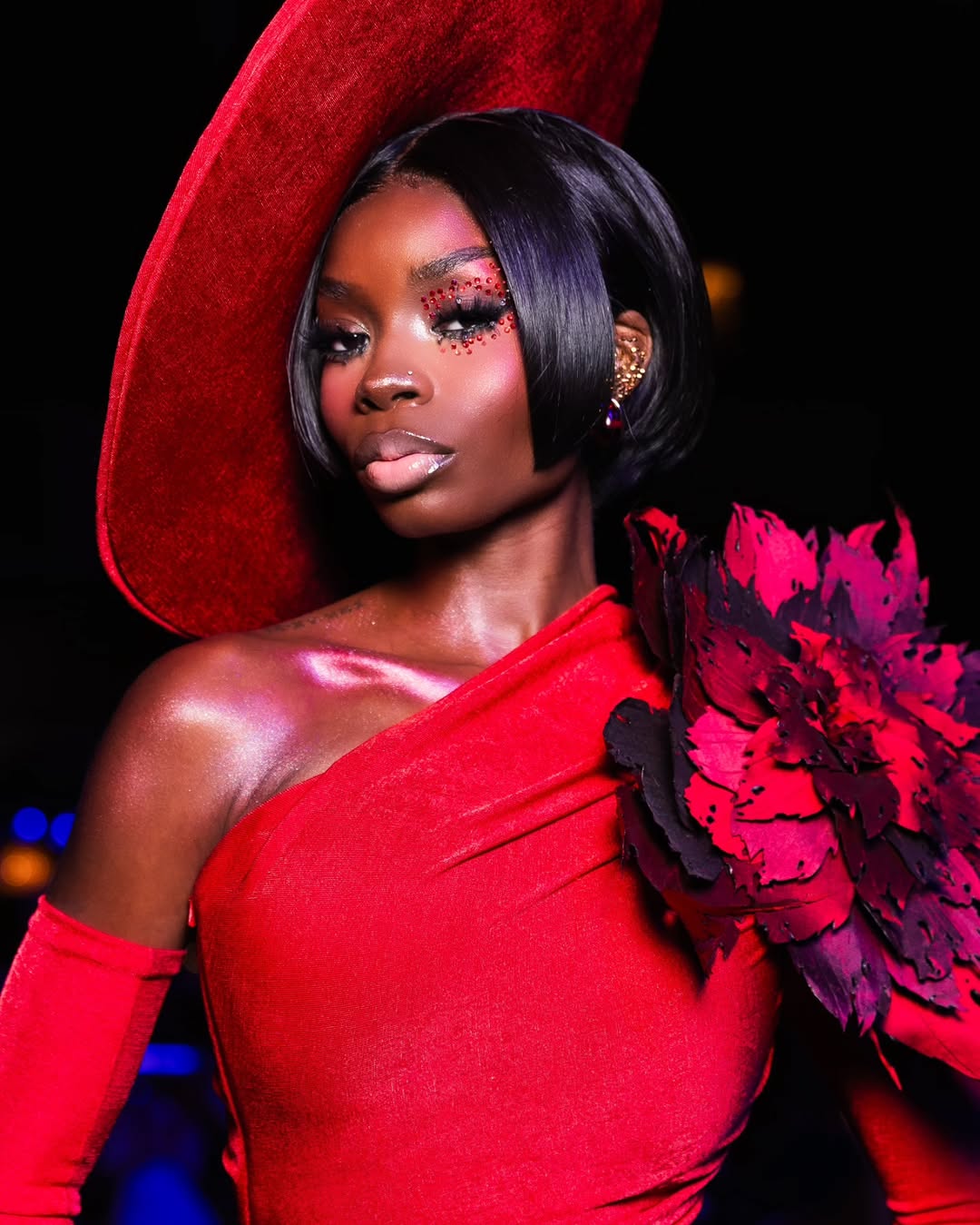
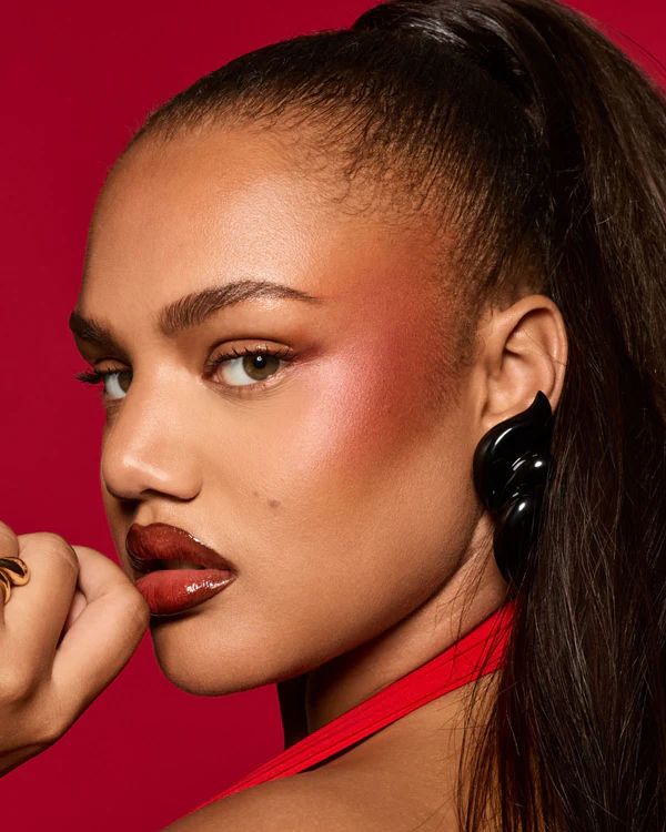
There’s a particular kind of confidence that comes from wearing a flush that refuses to be background. This look doesn’t politely warm the face; instead, it suggests motion. Heat. Life. It feels like you just came back from a fast walk, a good laugh, or a slightly dramatic moment you’ll never explain. When it’s done well, it reads like health, not “color.” In fact, it feels less like makeup and more like your complexion decided to show personality. That’s the appeal of red blush.
Yes, red blush has birthed subtler renditions over the years—softer roses, muted terracottas, blurred corals. Still, the original remains magazine-cover-worthy. Decade after decade, a simple flush sternly refuses to go away. Why would it? Because every true baddie recognizes fabulousity when they see it. Even the subtle makeup loyalists indulge the bold hue for a switch-up every now and then.
A history of heat
Part of the obsession is historical. A strong cheek has always been a signal, from vintage film-star glamour to editorial runway drama. However, what’s different now is the finish and the finesse. Today’s red blush is diffused, skin-like, and intentionally placed. It’s not a stripe. It’s not a stamp. Rather, it’s a gradient that moves with your face, garnering attention as you turn your head, then softening as if it was always meant to live there.
That said, this trend is honest. It doesn’t hide behind bronzer or highlighter. It sits front and center, which means technique matters more than ever. Shade, undertone, texture, and placement determine whether it reads as a natural bloom—or like the blush is wearing you. If you want it to look unforced, the process must be thoughtful.
Here’s how to clock in a good red blush like a top model…
#1. Think of it as complexion choreography
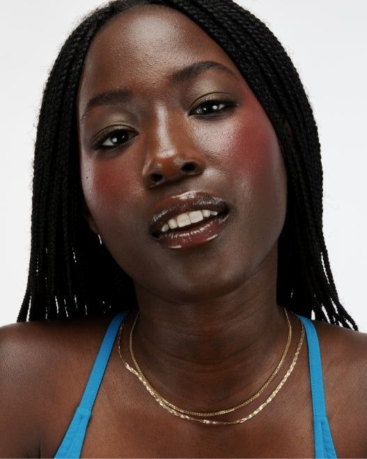
This style works best when the color follows your face’s natural rhythm. Typically, warmth blooms where blood flow sits closest to the surface: the apples, the high planes of the cheekbones, and sometimes a soft sweep across the bridge of the nose for that outdoorsy softness. When done right, it creates the illusion that your skin is reacting, not performing.
Moreover, the most elevated versions are built in a gradient. The center holds the deepest warmth, while the edges dissolve outward until there’s no obvious border. You should be able to move closer to the mirror and struggle to find where the pigment ends and the skin begins. That blur? That’s the luxury. Harsh edges are the giveaway.
#2. The finish decides whether it looks alive or placed
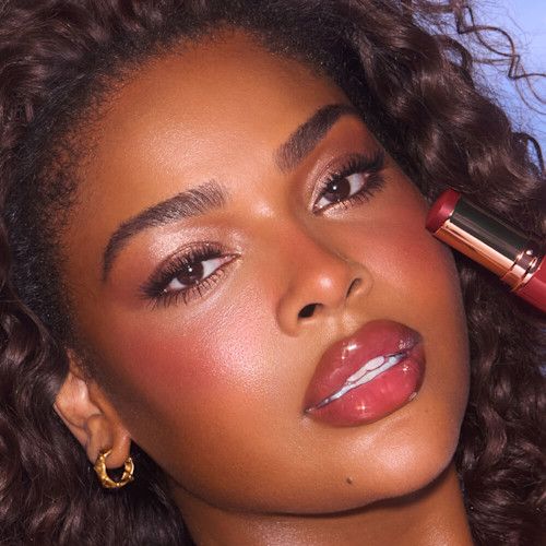
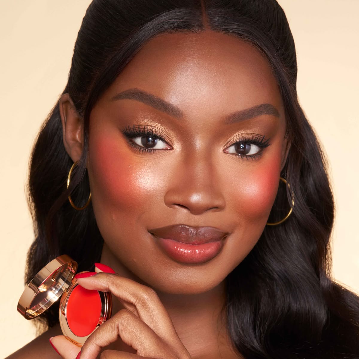
Texture changes everything. Cream and liquid formulas fuse with the skin, creating that lived-in warmth rising beneath the surface. They’re also easier to sheer out, which allows for impact without heaviness. In contrast, powder can look stunning, but it reads differently. More structured. More editorial. Therefore, powders require softer edges and a lighter hand, especially if your skin has texture or your base is matte.
Meanwhile, jelly and gel textures offer a modern middle ground. They’re bouncy, often sheer, sometimes quick-setting, and leave behind a veil that looks fresh and clean. Ultimately, choose your finish based on mood, not just skin type.
#3. Let the shade speak your undertone’s language
The most flattering red blush looks happen when the pigment translates naturally on your skin. Warm undertones glow in shades with coral, terracotta, or warm rose notes. These mimic sunlit warmth, so the color feels at home, even when it’s bold.
On the other hand, cool undertones often shine in truer, blue-leaning reds or berry tones. The effect is crisp and fresh, like winter air on the cheeks. Neutral undertones have options: warm for softness, cool for clarity. If a shade ever looks “separate” from your face, the culprit is usually undertone mismatch, or too much opacity.
#4. Placement changes the entire mood
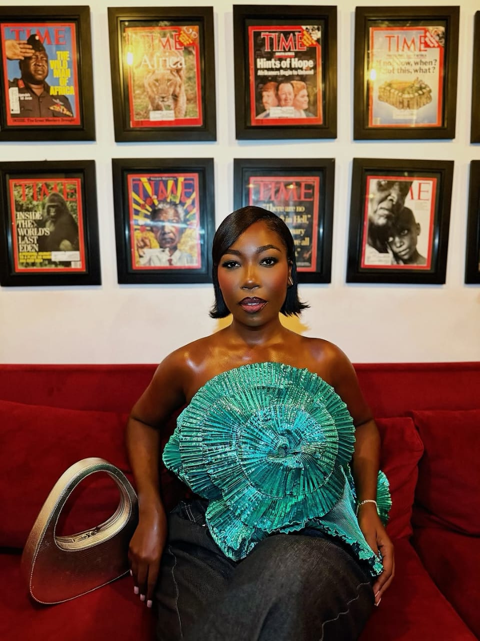
Placement is where flattering meets overpowering. For a sweet, approachable flush, keep the color closer to the apples and blend outward softly. Paired with minimal eye makeup and a hydrated lip, this reads youthful and fresh.
If you want lift, place the blush higher along the cheekbones and pull it slightly back toward the temples. Instantly, the face looks more awake and sculpted. For a true editorial moment, keep placement high, edges diffused, and the base clean. The color should feel intentional, not accidental. Sometimes, a one-centimeter shift changes everything.
#5. Make it look expensive
The secret is to start smaller than your confidence suggests. Always. Use tiny dots or a short swipe, then build gradually. The effect should bloom like a stain, not appear all at once. Additionally, blend using tapping motions rather than dragging. Tapping keeps the color concentrated and the edges soft, while dragging can pull pigment too low and flatten your lift.
A pro trick? Place the blush on the back of your hand first, then pick it up with fingers, a brush, or a sponge. This diffuses intensity before it touches your face. For added dimension, blend slightly beyond your placement, then return with one small touch at the highest point of the cheekbone. That layered effect creates depth instead of a flat wash.
#6. Pair it with makeup that doesn’t compete
Red blush becomes instantly more refined when the rest of the face is edited. Think groomed brows. Skin that still looks like skin. Lips that don’t fight for attention.
Clear gloss, a blurred stain, or a soft nude allows the cheeks to shine. However, if you want a bold lip too, harmony is non-negotiable. Keep tones related so the face reads cohesive, like matching accessories, not clashing prints. When lip and cheek echo each other, the result feels elevated.
#7. Make it wearable
If you want the trend without the drama, sheer it out. Mix a tiny amount into moisturizer or skin tint, then tap onto the cheeks for a soft wash. Alternatively, apply a light base first and layer gradually so you stay in control.
Another effortless method? The one-product face. Tap the same pigment onto cheeks and lips, then blend until cohesive. Not only does it save time, but it also makes the flush look more believable because the entire face shares one color story.
Shop editor’s finds
Wrapping up
Serve the red blush if you love expressive makeup. Serve it if you enjoy color with personality or want your complexion to look energetic and awake. Serve it if minimal eye looks are your comfort zone, because the face has room for one strong statement.
Pass if ultra-muted warmth is your signature and you’d rather your cheeks stay in the background. Or keep it as an occasional mood instead of a daily identity. Either way, this trend thrives on intentional placement and soft blending. It rewards anyone who likes their makeup to look considered.
Featured image: Danessa Myricks Beauty
—Read also
Source link
#Red #Blush #Bold #Beauty #Trend #Refuses #Fade


Post Comment