×
MacBook Neo vs MacBook M4 Air: Key Differences You Should Know

MacBook Neo vs MacBook M4 Air: Key Differences You Should Know

Apple’s MacBook lineup now includes devices designed for both premium users and budget buyers. The new MacBook M4 Air has a lot to offer with its Apple M-series chip, while the new MacBook Neo has focused on usability. Although they belong to the same family, they have been designed for very different users. Let’s compare them.

Design and Display

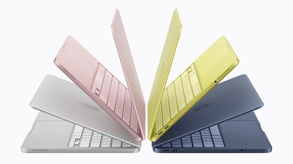
The MacBook M4 Air retains its signature design profile: a slim, light aluminum unibody that is just as portable as ever. The 13.6-inch display features a bright, colorful Liquid Retina display, perfect for work, play, and all forms of creativity.

The MacBook Neo, meanwhile, takes a more conservative approach with design. Its 13-inch LCD display is not a Retina display, and while it is perfectly suited for everyday use, it is not quite as bright or colorful as the M4 Air.

In simple terms, the MacBook M4 Air focuses on a premium display experience, while the MacBook Neo prioritizes affordability.

Performance and Processor

The major difference between the MacBook M4 Air and the MacBook Neo is the processor. The MacBook M4 Air is powered by the M4 chip, which has a 10-core CPU and a 10-core GPU.

Meanwhile, the MacBook Neo is powered by the A18 Pro chip, which has a 6-core CPU and a 5-core GPU. The MacBook Neo supports everyday activities like web browsing, streaming media, document creation, and online meetings. Therefore, the MacBook M4 Air is suitable for professionals, while the MacBook Neo is suitable for students.

When it comes to memory and storage, the MacBook M4 Air provides more flexibility. The laptop starts with 16GB of unified memory and can be expanded up to 32GB. Storage options range from 256GB to 2TB, which is useful for professionals who need extra space for files and applications.

The MacBook Neo keeps its configuration simpler. It comes with 8GB of memory and storage options of 256GB or 512GB. These specifications help students and casual users manage documents, applications, and media comfortably.

Overall, the MacBook M4 Air handles heavier loads better than the MacBook Neo.

Connectivity and Battery Life

image for MacBook Neo

The MacBook M4 Air takes the game to the next level in terms of connectivity. It has two Thunderbolt ports and Apple’s MagSafe charger. The MacBook M4 Air’s Wi-Fi 6E connectivity delivers fast internet speeds.

The MacBook Neo takes a simpler approach. It mainly includes standard USB-C ports and basic wireless connectivity. Some premium connectivity features available on the MacBook Air are not included in this model.

In terms of battery life, both laptops perform well. The MacBook M4 Air can last up to 18 hours on a single charge. The MacBook Neo is designed to last an entire day, though it does not match the MacBook Air’s battery life.

Price Comparison

In terms of price, there is a significant difference between the MacBook Neo and the MacBook M4 Air. While the MacBook M4 Air is priced at approximately Rs 90,068, the MacBook Neo is priced at Rs 69,990. This is the reason why the MacBook Neo is a good option for anyone looking for a budget-friendly computer.

To summarize, the best MacBook for you will depend on your intended use. The MacBook Neo is good for students and new users, while the MacBook M4 Air is good for professionals.

Source link
#MacBook #Neo #MacBook #Air #Key #Differences


By providing a needed security patch to an older version of iOS last month, Apple tacitly—but unofficially—acknowledged that avoiding the Liquid Glass aesthetic is a valid choice.

Now, according to anonymous sources who spoke to Bloomberg’s Mark Gurman, an upcoming update will address problems with Liquid Glass in macOS 26. If you haven’t updated because you hate it, or are worried the design flaws make it unusable, you are seen.

Gurman writes that Apple “is preparing what people internally consider to be a ‘slight redesign’ for macOS 27,” and that the company is looking to fix, “shadows and transparency quirks.”

Gurman’s sources sound a bit defensive, however. They tell him the Liquid Glass update “didn’t necessarily suffer from design problems,” but instead had “a not-completely-baked implementation from Apple’s software engineering team.” The fixes, then, are supposed to “make Liquid Glass look the way Apple’s design team intended it to from the start.” Got it? The designers thought everything through from the beginning, but the artless neanderthals who built their designs into software—this thinking goes—let them down.

My first impression was that it was overly generous of Gurman to give voice to this framing of the Liquid Glass story, but I have to admit that it’s also a genuinely plausible explanation for just how hated the design scheme ended up being.

For instance, while Apple has already chipped away at some of the bigger problems, Tahoe shipped with some issues that were beyond annoying and actually interfered with usability, particularly for low vision people. Before the 26.3 update in February, as OS X Daily noted, choosing the option to reduce transparency “would leave considerable transparent effects, including in sidebars, headers, titlebars, search boxes, and more, leading to situations where text would overlap and interface elements would be washed out with blurry colors and interface elements.”

Then again, some designs were heavily criticized on an aesthetic basis, not as bad implementation. There’s probably no bigger Apple fan than John Gruber of Daring Fireball, and his take on the redesign of some of the icons was scorching: “I don’t think the old icons for these apps from MacOS 15 were particularly good — Apple has mostly lost its “icons look cool” game. But the new ones in MacOS 26 Tahoe are objectively terrible.”

Gurman has claimed in the past that Liquid Glass is sort of a long game, rolled out in advance of the release of the 20th anniversary iPhone, which he expects to be a huge design milestone for Apple. Supposedly, that phone’s overall vibe will benefit from Liquid Glass. When all is revealed, maybe the world will agree.

In the meantime, macOS is getting some tweaks, and we should expect, Gurman says, “more of a cleanup and refinement effort aligned with the company’s wider push to polish its software this year.”

#Apple #Reportedly #Retooling #Liquid #Glass #Problems #macOSApple,Liquid Glass,macos 27">Yes, Apple Is Reportedly Retooling Some Liquid Glass Problems for macOS 27
                By providing a needed security patch to an older version of iOS last month, Apple tacitly—but unofficially—acknowledged that avoiding the Liquid Glass aesthetic is a valid choice. Now, according to anonymous sources who spoke to Bloomberg’s Mark Gurman, an upcoming update will address problems with Liquid Glass in macOS 26. If you haven’t updated because you hate it, or are worried the design flaws make it unusable, you are seen.

 Gurman writes that Apple “is preparing what people internally consider to be a ‘slight redesign’ for macOS 27,” and that the company is looking to fix, “shadows and transparency quirks.” Gurman’s sources sound a bit defensive, however. They tell him the Liquid Glass update “didn’t necessarily suffer from design problems,” but instead had “a not-completely-baked implementation from Apple’s software engineering team.” The fixes, then, are supposed to “make Liquid Glass look the way Apple’s design team intended it to from the start.” Got it? The designers thought everything through from the beginning, but the artless neanderthals who built their designs into software—this thinking goes—let them down. My first impression was that it was overly generous of Gurman to give voice to this framing of the Liquid Glass story, but I have to admit that it’s also a genuinely plausible explanation for just how hated the design scheme ended up being. For instance, while Apple has already chipped away at some of the bigger problems, Tahoe shipped with some issues that were beyond annoying and actually interfered with usability, particularly for low vision people. Before the 26.3 update in February, as OS X Daily noted, choosing the option to reduce transparency “would leave considerable transparent effects, including in sidebars, headers, titlebars, search boxes, and more, leading to situations where text would overlap and interface elements would be washed out with blurry colors and interface elements.”

 Then again, some designs were heavily criticized on an aesthetic basis, not as bad implementation. There’s probably no bigger Apple fan than John Gruber of Daring Fireball, and his take on the redesign of some of the icons was scorching: “I don’t think the old icons for these apps from MacOS 15 were particularly good — Apple has mostly lost its “icons look cool” game. But the new ones in MacOS 26 Tahoe are objectively terrible.”

 Gurman has claimed in the past that Liquid Glass is sort of a long game, rolled out in advance of the release of the 20th anniversary iPhone, which he expects to be a huge design milestone for Apple. Supposedly, that phone’s overall vibe will benefit from Liquid Glass. When all is revealed, maybe the world will agree. In the meantime, macOS is getting some tweaks, and we should expect, Gurman says, “more of a cleanup and refinement effort aligned with the company’s wider push to polish its software this year.”      #Apple #Reportedly #Retooling #Liquid #Glass #Problems #macOSApple,Liquid Glass,macos 27

acknowledged that avoiding the Liquid Glass aesthetic is a valid choice.

Now, according to anonymous sources who spoke to Bloomberg’s Mark Gurman, an upcoming update will address problems with Liquid Glass in macOS 26. If you haven’t updated because you hate it, or are worried the design flaws make it unusable, you are seen.

Gurman writes that Apple “is preparing what people internally consider to be a ‘slight redesign’ for macOS 27,” and that the company is looking to fix, “shadows and transparency quirks.”

Gurman’s sources sound a bit defensive, however. They tell him the Liquid Glass update “didn’t necessarily suffer from design problems,” but instead had “a not-completely-baked implementation from Apple’s software engineering team.” The fixes, then, are supposed to “make Liquid Glass look the way Apple’s design team intended it to from the start.” Got it? The designers thought everything through from the beginning, but the artless neanderthals who built their designs into software—this thinking goes—let them down.

My first impression was that it was overly generous of Gurman to give voice to this framing of the Liquid Glass story, but I have to admit that it’s also a genuinely plausible explanation for just how hated the design scheme ended up being.

For instance, while Apple has already chipped away at some of the bigger problems, Tahoe shipped with some issues that were beyond annoying and actually interfered with usability, particularly for low vision people. Before the 26.3 update in February, as OS X Daily noted, choosing the option to reduce transparency “would leave considerable transparent effects, including in sidebars, headers, titlebars, search boxes, and more, leading to situations where text would overlap and interface elements would be washed out with blurry colors and interface elements.”

Then again, some designs were heavily criticized on an aesthetic basis, not as bad implementation. There’s probably no bigger Apple fan than John Gruber of Daring Fireball, and his take on the redesign of some of the icons was scorching: “I don’t think the old icons for these apps from MacOS 15 were particularly good — Apple has mostly lost its “icons look cool” game. But the new ones in MacOS 26 Tahoe are objectively terrible.”

Gurman has claimed in the past that Liquid Glass is sort of a long game, rolled out in advance of the release of the 20th anniversary iPhone, which he expects to be a huge design milestone for Apple. Supposedly, that phone’s overall vibe will benefit from Liquid Glass. When all is revealed, maybe the world will agree.

In the meantime, macOS is getting some tweaks, and we should expect, Gurman says, “more of a cleanup and refinement effort aligned with the company’s wider push to polish its software this year.”

#Apple #Reportedly #Retooling #Liquid #Glass #Problems #macOSApple,Liquid Glass,macos 27">Yes, Apple Is Reportedly Retooling Some Liquid Glass Problems for macOS 27Yes, Apple Is Reportedly Retooling Some Liquid Glass Problems for macOS 27
                By providing a needed security patch to an older version of iOS last month, Apple tacitly—but unofficially—acknowledged that avoiding the Liquid Glass aesthetic is a valid choice. Now, according to anonymous sources who spoke to Bloomberg’s Mark Gurman, an upcoming update will address problems with Liquid Glass in macOS 26. If you haven’t updated because you hate it, or are worried the design flaws make it unusable, you are seen.

 Gurman writes that Apple “is preparing what people internally consider to be a ‘slight redesign’ for macOS 27,” and that the company is looking to fix, “shadows and transparency quirks.” Gurman’s sources sound a bit defensive, however. They tell him the Liquid Glass update “didn’t necessarily suffer from design problems,” but instead had “a not-completely-baked implementation from Apple’s software engineering team.” The fixes, then, are supposed to “make Liquid Glass look the way Apple’s design team intended it to from the start.” Got it? The designers thought everything through from the beginning, but the artless neanderthals who built their designs into software—this thinking goes—let them down. My first impression was that it was overly generous of Gurman to give voice to this framing of the Liquid Glass story, but I have to admit that it’s also a genuinely plausible explanation for just how hated the design scheme ended up being. For instance, while Apple has already chipped away at some of the bigger problems, Tahoe shipped with some issues that were beyond annoying and actually interfered with usability, particularly for low vision people. Before the 26.3 update in February, as OS X Daily noted, choosing the option to reduce transparency “would leave considerable transparent effects, including in sidebars, headers, titlebars, search boxes, and more, leading to situations where text would overlap and interface elements would be washed out with blurry colors and interface elements.”

 Then again, some designs were heavily criticized on an aesthetic basis, not as bad implementation. There’s probably no bigger Apple fan than John Gruber of Daring Fireball, and his take on the redesign of some of the icons was scorching: “I don’t think the old icons for these apps from MacOS 15 were particularly good — Apple has mostly lost its “icons look cool” game. But the new ones in MacOS 26 Tahoe are objectively terrible.”

 Gurman has claimed in the past that Liquid Glass is sort of a long game, rolled out in advance of the release of the 20th anniversary iPhone, which he expects to be a huge design milestone for Apple. Supposedly, that phone’s overall vibe will benefit from Liquid Glass. When all is revealed, maybe the world will agree. In the meantime, macOS is getting some tweaks, and we should expect, Gurman says, “more of a cleanup and refinement effort aligned with the company’s wider push to polish its software this year.”      #Apple #Reportedly #Retooling #Liquid #Glass #Problems #macOSApple,Liquid Glass,macos 27

By providing a needed security patch to an older version of iOS last month, Apple tacitly—but unofficially—acknowledged that avoiding the Liquid Glass aesthetic is a valid choice.

Now, according to anonymous sources who spoke to Bloomberg’s Mark Gurman, an upcoming update will address problems with Liquid Glass in macOS 26. If you haven’t updated because you hate it, or are worried the design flaws make it unusable, you are seen.

Gurman writes that Apple “is preparing what people internally consider to be a ‘slight redesign’ for macOS 27,” and that the company is looking to fix, “shadows and transparency quirks.”

Gurman’s sources sound a bit defensive, however. They tell him the Liquid Glass update “didn’t necessarily suffer from design problems,” but instead had “a not-completely-baked implementation from Apple’s software engineering team.” The fixes, then, are supposed to “make Liquid Glass look the way Apple’s design team intended it to from the start.” Got it? The designers thought everything through from the beginning, but the artless neanderthals who built their designs into software—this thinking goes—let them down.

My first impression was that it was overly generous of Gurman to give voice to this framing of the Liquid Glass story, but I have to admit that it’s also a genuinely plausible explanation for just how hated the design scheme ended up being.

For instance, while Apple has already chipped away at some of the bigger problems, Tahoe shipped with some issues that were beyond annoying and actually interfered with usability, particularly for low vision people. Before the 26.3 update in February, as OS X Daily noted, choosing the option to reduce transparency “would leave considerable transparent effects, including in sidebars, headers, titlebars, search boxes, and more, leading to situations where text would overlap and interface elements would be washed out with blurry colors and interface elements.”

Then again, some designs were heavily criticized on an aesthetic basis, not as bad implementation. There’s probably no bigger Apple fan than John Gruber of Daring Fireball, and his take on the redesign of some of the icons was scorching: “I don’t think the old icons for these apps from MacOS 15 were particularly good — Apple has mostly lost its “icons look cool” game. But the new ones in MacOS 26 Tahoe are objectively terrible.”

Gurman has claimed in the past that Liquid Glass is sort of a long game, rolled out in advance of the release of the 20th anniversary iPhone, which he expects to be a huge design milestone for Apple. Supposedly, that phone’s overall vibe will benefit from Liquid Glass. When all is revealed, maybe the world will agree.

In the meantime, macOS is getting some tweaks, and we should expect, Gurman says, “more of a cleanup and refinement effort aligned with the company’s wider push to polish its software this year.”

#Apple #Reportedly #Retooling #Liquid #Glass #Problems #macOSApple,Liquid Glass,macos 27

After three people died on a cruise ship struck by a hantavirus, authorities are actively tracking down 29 people who had left the ship. They’re trying to trace the spread of the virus. It’s a long, arduous, global process to find and notify people who might be at risk of infection.

Hey, wasn’t there supposed to be an app for that?

Contact-tracing apps were a global effort starting in 2020 during the Covid-19 pandemic. Enabled by phone companies like Apple and Google, contact tracing was designed to use Bluetooth connections to detect when people had come in contact with someone who had or would later test positive for Covid and report as much. It didn’t do much to solve the spread of the pandemic, but tracking the virus became more effective at least. The same process wouldn’t go well for the hantavirus problem.

“There is no use of apps for this hantavirus outbreak,” Emily Gurley, an epidemiologist at Johns Hopkins University, wrote in an email response to WIRED. “The number of cases are small, and it’s important to trace all contacts exactly to stop transmission.”

On a smaller scale of infection like this, officials have to start at the source (an infected individual), then go person-by-person, confirming where they went and who they might have come into contact with. Data collected by apps from a broad swath of devices would not be anywhere close to accurate enough to give a good idea of where the virus might have hitchhiked to next.

Contact tracing on a wider scale, like, say, a global pandemic, is less about tracking the individual infections and more about understanding what parts of the population might be affected, giving people the opportunity to self-quarantine after exposure. But that depends on how people choose to respond, and how the technology is utilized by public emergency systems. During the Covid pandemic, contact-tracing via apps tended to work better in more carefully managed European countries, but did not slow the spread in the US.

Making devices accessible to that kind of proximity information has also brought all sorts of concerns about privacy, given that the technology would require always-on access to work properly. Contact tracing also struggled to maintain accuracy, and in some cases could be providing false negatives or positives that don’t help further real information about the spread of the virus.

Especially in the case of something like the Hantavirus, where every person on that cruise ship can theoretically be directly tracked and contacted, it’s better to do that process the hard way.

“During small but highly fatal outbreaks, more precision is required,” Gurley wrote.

#ContactTracing #Apps #Hantaviruscoronavirus,covid-19,viruses,health,pandemics">Could Contact-Tracing Apps Help With the Hantavirus? Not ReallyAfter three people died on a cruise ship struck by a hantavirus, authorities are actively tracking down 29 people who had left the ship. They’re trying to trace the spread of the virus. It’s a long, arduous, global process to find and notify people who might be at risk of infection.Hey, wasn’t there supposed to be an app for that?Contact-tracing apps were a global effort starting in 2020 during the Covid-19 pandemic. Enabled by phone companies like Apple and Google, contact tracing was designed to use Bluetooth connections to detect when people had come in contact with someone who had or would later test positive for Covid and report as much. It didn’t do much to solve the spread of the pandemic, but tracking the virus became more effective at least. The same process wouldn’t go well for the hantavirus problem.“There is no use of apps for this hantavirus outbreak,” Emily Gurley, an epidemiologist at Johns Hopkins University, wrote in an email response to WIRED. “The number of cases are small, and it’s important to trace all contacts exactly to stop transmission.”On a smaller scale of infection like this, officials have to start at the source (an infected individual), then go person-by-person, confirming where they went and who they might have come into contact with. Data collected by apps from a broad swath of devices would not be anywhere close to accurate enough to give a good idea of where the virus might have hitchhiked to next.Contact tracing on a wider scale, like, say, a global pandemic, is less about tracking the individual infections and more about understanding what parts of the population might be affected, giving people the opportunity to self-quarantine after exposure. But that depends on how people choose to respond, and how the technology is utilized by public emergency systems. During the Covid pandemic, contact-tracing via apps tended to work better in more carefully managed European countries, but did not slow the spread in the US.Making devices accessible to that kind of proximity information has also brought all sorts of concerns about privacy, given that the technology would require always-on access to work properly. Contact tracing also struggled to maintain accuracy, and in some cases could be providing false negatives or positives that don’t help further real information about the spread of the virus.Especially in the case of something like the Hantavirus, where every person on that cruise ship can theoretically be directly tracked and contacted, it’s better to do that process the hard way.“During small but highly fatal outbreaks, more precision is required,” Gurley wrote.#ContactTracing #Apps #Hantaviruscoronavirus,covid-19,viruses,health,pandemics

hantavirus, authorities are actively tracking down 29 people who had left the ship. They’re trying to trace the spread of the virus. It’s a long, arduous, global process to find and notify people who might be at risk of infection.

Hey, wasn’t there supposed to be an app for that?

Contact-tracing apps were a global effort starting in 2020 during the Covid-19 pandemic. Enabled by phone companies like Apple and Google, contact tracing was designed to use Bluetooth connections to detect when people had come in contact with someone who had or would later test positive for Covid and report as much. It didn’t do much to solve the spread of the pandemic, but tracking the virus became more effective at least. The same process wouldn’t go well for the hantavirus problem.

“There is no use of apps for this hantavirus outbreak,” Emily Gurley, an epidemiologist at Johns Hopkins University, wrote in an email response to WIRED. “The number of cases are small, and it’s important to trace all contacts exactly to stop transmission.”

On a smaller scale of infection like this, officials have to start at the source (an infected individual), then go person-by-person, confirming where they went and who they might have come into contact with. Data collected by apps from a broad swath of devices would not be anywhere close to accurate enough to give a good idea of where the virus might have hitchhiked to next.

Contact tracing on a wider scale, like, say, a global pandemic, is less about tracking the individual infections and more about understanding what parts of the population might be affected, giving people the opportunity to self-quarantine after exposure. But that depends on how people choose to respond, and how the technology is utilized by public emergency systems. During the Covid pandemic, contact-tracing via apps tended to work better in more carefully managed European countries, but did not slow the spread in the US.

Making devices accessible to that kind of proximity information has also brought all sorts of concerns about privacy, given that the technology would require always-on access to work properly. Contact tracing also struggled to maintain accuracy, and in some cases could be providing false negatives or positives that don’t help further real information about the spread of the virus.

Especially in the case of something like the Hantavirus, where every person on that cruise ship can theoretically be directly tracked and contacted, it’s better to do that process the hard way.

“During small but highly fatal outbreaks, more precision is required,” Gurley wrote.

#ContactTracing #Apps #Hantaviruscoronavirus,covid-19,viruses,health,pandemics">Could Contact-Tracing Apps Help With the Hantavirus? Not Really

After three people died on a cruise ship struck by a hantavirus, authorities are actively tracking down 29 people who had left the ship. They’re trying to trace the spread of the virus. It’s a long, arduous, global process to find and notify people who might be at risk of infection.

Hey, wasn’t there supposed to be an app for that?

Contact-tracing apps were a global effort starting in 2020 during the Covid-19 pandemic. Enabled by phone companies like Apple and Google, contact tracing was designed to use Bluetooth connections to detect when people had come in contact with someone who had or would later test positive for Covid and report as much. It didn’t do much to solve the spread of the pandemic, but tracking the virus became more effective at least. The same process wouldn’t go well for the hantavirus problem.

“There is no use of apps for this hantavirus outbreak,” Emily Gurley, an epidemiologist at Johns Hopkins University, wrote in an email response to WIRED. “The number of cases are small, and it’s important to trace all contacts exactly to stop transmission.”

On a smaller scale of infection like this, officials have to start at the source (an infected individual), then go person-by-person, confirming where they went and who they might have come into contact with. Data collected by apps from a broad swath of devices would not be anywhere close to accurate enough to give a good idea of where the virus might have hitchhiked to next.

Contact tracing on a wider scale, like, say, a global pandemic, is less about tracking the individual infections and more about understanding what parts of the population might be affected, giving people the opportunity to self-quarantine after exposure. But that depends on how people choose to respond, and how the technology is utilized by public emergency systems. During the Covid pandemic, contact-tracing via apps tended to work better in more carefully managed European countries, but did not slow the spread in the US.

Making devices accessible to that kind of proximity information has also brought all sorts of concerns about privacy, given that the technology would require always-on access to work properly. Contact tracing also struggled to maintain accuracy, and in some cases could be providing false negatives or positives that don’t help further real information about the spread of the virus.

Especially in the case of something like the Hantavirus, where every person on that cruise ship can theoretically be directly tracked and contacted, it’s better to do that process the hard way.

“During small but highly fatal outbreaks, more precision is required,” Gurley wrote.

#ContactTracing #Apps #Hantaviruscoronavirus,covid-19,viruses,health,pandemics

Post Comment