
Welcome to 2026. It’s the year we all hoped PC hardware would finally get cheaper, so we could build new PCs without breaking the bank. Unfortunately, none of this has come true. Our beloved AI companions, like ChatGPT, have bought up most of the RAM that will be produced over the next few years, increasing prices and limiting accessibility. This means that if you were thinking about building a PC, your budget will need to increase, or you’ll need to cut corners on accessories. That’s exactly where HyperX’s Cloud Jet Dual Wireless headphones come into play. These gaming headphones cost ₹4,999 (or $50) and offer wireless connectivity via both a dongle and Bluetooth, a claimed 25 hours of battery life, and 40mm drivers.
Those are quite decent specs for not a lot of money, and that made me wonder: where has HP cut corners? To find out, I called my friends, got the Cloud Jet Wireless in for a review, and used it as my primary gaming headset, with both my phone and the Asus ROG XBOX Ally.
HyperX Cloud Jet Dual Wireless Review
Summary
The HyperX Cloud Jet Dual Wireless headphones are a great entry point for someone looking for a dedicated pair of gaming headphones without breaking the bank. They connect with all the consoles, including PS5, Nintendo Switch, and Steam Deck, sound pretty decent, and fit snugly on your head without causing any discomfort.
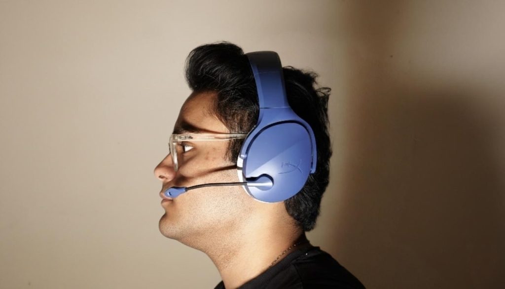
Design & Comfort
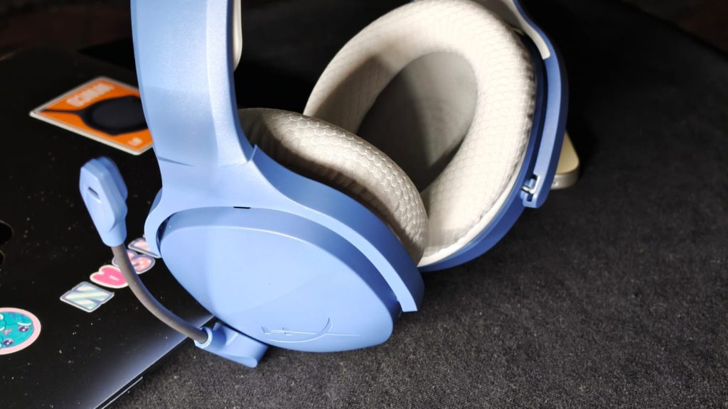
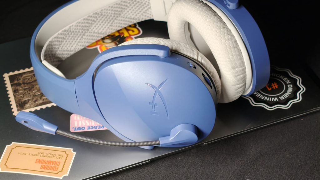
HyperX hasn’t tried to revolutionize headphones with the Cloud Jet Wireless. In fact, they look exactly how you’d expect them to. And I quite like it. The blue headphones add a touch of uniqueness to a somewhat black-ish, stale world, all while remaining conventional. Inside the box, you get the headphones, along with the 2.4 GHz dongle, and that’s it. These don’t fold like others, so travelling with them could be a challenge.
The left side of the headphones houses all the controls. This includes a power/pairing button, a USB-C charging port, a toggle to switch between Wi-Fi and Bluetooth modes, and a physical volume adjuster. I can’t stress enough how much I love physical volume controls, as they work 100% of the time without needing to fiddle with annoying touch controls.
What HP has nailed out of the park is the comfort. The headphones are light, weighing under 300 grams. This allows them to feel natural while sitting on the head. Speaking of that, there’s a very niche elastic headband that distributes the weight perfectly, adding comfort. The mesh ear cushions are large and do a fantastic job of enveloping you in sound without clamping your ears too hard. I wore the Cloud Jet headphones for a three-hour BGMI marathon at night and never once felt uncomfortable. My ears also tend to heat up during intense battles, which can make over-the-ear headphones uncomfortable, but it wasn’t an issue here.
Sound Quality
Gamers are perhaps the most picky buyers on the market. They need the best specs at the lowest price and don’t want to compromise on anything. Well, that can’t be true for everything. Brands have to cut certain corners to achieve a lower price. However, with the Cloud Jet Wireless, sound isn’t where corners have been cut. In fact, the audio on these headphones punches way above their weight. In games like F1 2025, Forza Motorsport, and COD Modern Warfare, I noticed the sound was punchy with bass, which was necessary to feel the explosions. I could hear faint footsteps in games like Counter-Strike, which wasn’t enough to improve my trash skills, but did help me not get killed by a knife every time. Beyond that, the dialogues were clear, and the treble is decent as well.
Music listening sessions were better than many budget TWS earbuds I’ve tested, but not amazing. Songs with plenty of instruments will lack separation, but if you haven’t been testing headphones for a living like me, the difference isn’t that much.
If I had to pick one reason to buy the Cloud Jet Wireless, it would be the mic. The swivel-to-activate feature is what every single gaming headphone should adopt, simply because it’s convenient. Want to talk to your gaming buddies? Just swivel the mic down, and it’s activated. Swivel it back, and it’s disabled without needing to fiddle with the PC or game settings. Even the quality is really good. My teammates reported hearing me loud and clear, with little background noise.
Battery Life
HP claims the Cloud Wireless headphones can last 25 hours on Bluetooth 5.2 or 20 hours on 2.4 GHz mode. I found these claims to be plenty accurate. During my review period, when usage was split between a few hours of music listening at about 75% volume and gaming, I hit 23 hours. That translates to more than a week of use — more than enough for most people. Charging is handled via the USB-C port, which is a very nice feature if you don’t like carrying multiple cables, like me. The only gripe was the charging time, which, at 4 hours from empty to full, is a bit slow.
Verdict
At ₹4,999 ($50), the HyperX Cloud Jet Dual Wireless headphones are hard to beat. They serve as a great entry point for someone looking to get a dedicated pair of gaming headphones without breaking the bank. They connect with all the consoles, including PS5, Nintendo Switch, and Steam Deck, sound pretty decent, and fit snugly on your head without causing any discomfort. Combine all that with a battery life that lasts for weeks, and I’d be using them as my primary gaming headphones. If you’re in the market for such a thing, these HyperX headphones are hard to ignore.
Source link
#HyperX #Cloud #Jet #Dual #Wireless #Budget #Gaming #Headphones
, iPad (A16), and newer iPads.
Go to Settings.
Tap Battery.
Open Battery Health.
View details such as Maximum Capacity, Cycle Count, Battery Status, Manufacturing Date, First Use Date, and the 80% Charging Limit.
If you have an old iPad, you won’t see the Battery Health option in the Settings menu. The reason behind this restriction remains unknown, as Apple has not disclosed it yet. The old operating system of these iPads does not even support the Battery Health menu.
How to Check Battery Health on Older iPads
Apple provides an online battery diagnostic process for iPads that do not have the Battery Health option. This is the proper way to diagnose your device’s battery without downloading any additional software. First, contact Apple Support and describe your battery problems, which may include rapid battery drain, slow charging, and automatic shutdowns of your iPad. Apple Support will conduct a remote battery diagnostic on your iPad. They will be able to tell you all the vital information regarding your battery.
Use coconutBattery on a Mac
Another way to check your iPad’s battery health is through coconutBattery. The app is available for macOS and supports Apple devices, including iPads.
Download coconutBattery on your Mac.
Connect your iPad via a USB cable.
Launch the application.
Select your device and see its battery details.
It provides information on Battery Health, Current Capacity, Design Capacity, Charge Cycles, Battery Temperature, and Charging Status. Please note that some more advanced options will be available only in the paid version.
Tips to Keep Your Older iPad Battery Healthy
Ensure that you only use certified chargers: Your iPad should be charged by Apple-certified and MFi-certified chargers and cables.
Avoid using your iPad in extreme temperatures: it should not be exposed to direct sunlight or extremely high temperatures.
Keep your iPad software up to date: Update your device to the latest iPadOS.
Screen lock: Locking your iPad helps conserve battery power.
Airplane mode in areas with poor signal: If the signal strength is low, activate airplane mode to conserve battery.
Wi-Fi connection: Connect to Wi-Fi whenever it is possible.
Unplug unnecessary devices: Unplug any USB-C device that is no longer needed.
#Apple #Doesnt #Show #Battery #Health #Older #iPadsHeres #Checkapple")
![FCC Chairman Wants to Repeal a Key Rule That Would Fundamentally Change Broadcast News
Federal Communications Commission Chairman Brendan Carr wants to repeal a rule that has prevented a select handful of broadcasters from taking full control of the media landscape. Back in 2004, Congress instructed the FCC to enact a national ownership cap that would bar any one broadcast station owner from reaching more than 39% of American households. For more than 20 years, the rule has kept mega mergers in the TV broadcasting industry from gobbling up the entire media ecosystem. Now, Carr is proposing to repeal that national ownership cap rule, which, if successful, would mean broadcast TV giants will pretty much have a green light for mergers, even if it meant that one company would gain access to most of the media landscape. Carr expressed his intentions in an op-ed published by the far-right organization Breitbart. In the op-ed, he claimed that the cap was once helpful in protecting local news stations, but now it was becoming an obstacle as they compete with national news, large streamers, and social media giants.
Instead of a blanket rule, Carr wants to create a new “case-by-case approach.” “Previously, the cap operated as a blanket prohibition on any and all deals that would combine stations in excess of the 39 percent limit—regardless of whether it was a good deal or a bad one for the country,” Carr wrote in the op-ed. “Our new proposal would allow the FCC to approve deals that exceed the 39 percent cap, but only if doing so would promote the public interest.”
Major broadcasters have been lobbying for a change to the rule for quite some time now. One such mega TV broadcasting company that lobbied for the rule change is Nexstar. Earlier this year, the FCC granted Nexstar a waiver for the 39% national ownership cap rule and approved its acquisition of rival Tegna. The merger is still currently facing court challenges over antitrust claims, but if it is finalized, then Nexstar is estimated to expand its reach to at least 60% of American households. Sinclair, another Trump-allied major broadcaster that was behind a particularly infamous PR debacle during Trump’s first administration, is also eyeing a merger and commended the proposed rule change as “common sense.” Both companies also famously refused to air Jimmy Kimmel’s show on their channels late last year after the late-night host’s comments about Charlie Kirk drew ire from the Trump administration.
[embed]https://www.youtube.com/watch?v=_fHfgU8oMSo[/embed] The FCC will vote on eliminating the rule on August 6th. There are three commissioners, two Republicans and one Democrat. The lone Democratic FCC Commissioner, Anna Gomez, took to X to voice her staunch opposition. “The FCC just announced it will move forward with its unlawful effort to hand control of the public airwaves to billionaire buddies of this administration,” Gomez wrote. “This will destroy local newsrooms, silence community reporting, and drive-up costs for American families.” Even if the action passes the FCC vote, it’s likely to receive pushback from both sides of the aisle in Congress. “Trump’s FCC Chair is trying to illegally rewrite the rules to make it easier for billionaires to line their own pockets while jacking up costs and controlling what Americans watch,” Sen. Elizabeth Warren said in a statement. “After rubber-stamping the Nexstar-Tegna megamerger, this looks like the Trump administration’s latest attempt to roll out the red carpet for more antitrust disasters.”
Critics believe that because the rule was created following Congress’s action, it is up to Congress to determine if it should be retired. But Carr insists that the FCC has the authority to modify or repeal the rule. #FCC #Chairman #Repeal #Key #Rule #Fundamentally #Change #Broadcast #NewsBrendan carr,broadcast television,FCC](https://i1.wp.com/gizmodo.com/app/uploads/2026/07/GettyImages-2262359639-1280x888.jpg?ssl=1 "FCC Chairman Wants to Repeal a Key Rule That Would Fundamentally Change Broadcast News
Federal Communications Commission Chairman Brendan Carr wants to repeal a rule that has prevented a select handful of broadcasters from taking full control of the media landscape. Back in 2004, Congress instructed the FCC to enact a national ownership cap that would bar any one broadcast station owner from reaching more than 39% of American households. For more than 20 years, the rule has kept mega mergers in the TV broadcasting industry from gobbling up the entire media ecosystem. Now, Carr is proposing to repeal that national ownership cap rule, which, if successful, would mean broadcast TV giants will pretty much have a green light for mergers, even if it meant that one company would gain access to most of the media landscape. Carr expressed his intentions in an op-ed published by the far-right organization Breitbart. In the op-ed, he claimed that the cap was once helpful in protecting local news stations, but now it was becoming an obstacle as they compete with national news, large streamers, and social media giants.
Instead of a blanket rule, Carr wants to create a new “case-by-case approach.” “Previously, the cap operated as a blanket prohibition on any and all deals that would combine stations in excess of the 39 percent limit—regardless of whether it was a good deal or a bad one for the country,” Carr wrote in the op-ed. “Our new proposal would allow the FCC to approve deals that exceed the 39 percent cap, but only if doing so would promote the public interest.”
Major broadcasters have been lobbying for a change to the rule for quite some time now. One such mega TV broadcasting company that lobbied for the rule change is Nexstar. Earlier this year, the FCC granted Nexstar a waiver for the 39% national ownership cap rule and approved its acquisition of rival Tegna. The merger is still currently facing court challenges over antitrust claims, but if it is finalized, then Nexstar is estimated to expand its reach to at least 60% of American households. Sinclair, another Trump-allied major broadcaster that was behind a particularly infamous PR debacle during Trump’s first administration, is also eyeing a merger and commended the proposed rule change as “common sense.” Both companies also famously refused to air Jimmy Kimmel’s show on their channels late last year after the late-night host’s comments about Charlie Kirk drew ire from the Trump administration.
[embed]https://www.youtube.com/watch?v=_fHfgU8oMSo[/embed] The FCC will vote on eliminating the rule on August 6th. There are three commissioners, two Republicans and one Democrat. The lone Democratic FCC Commissioner, Anna Gomez, took to X to voice her staunch opposition. “The FCC just announced it will move forward with its unlawful effort to hand control of the public airwaves to billionaire buddies of this administration,” Gomez wrote. “This will destroy local newsrooms, silence community reporting, and drive-up costs for American families.” Even if the action passes the FCC vote, it’s likely to receive pushback from both sides of the aisle in Congress. “Trump’s FCC Chair is trying to illegally rewrite the rules to make it easier for billionaires to line their own pockets while jacking up costs and controlling what Americans watch,” Sen. Elizabeth Warren said in a statement. “After rubber-stamping the Nexstar-Tegna megamerger, this looks like the Trump administration’s latest attempt to roll out the red carpet for more antitrust disasters.”
Critics believe that because the rule was created following Congress’s action, it is up to Congress to determine if it should be retired. But Carr insists that the FCC has the authority to modify or repeal the rule. #FCC #Chairman #Repeal #Key #Rule #Fundamentally #Change #Broadcast #NewsBrendan carr,broadcast television,FCC")
![FCC Chairman Wants to Repeal a Key Rule That Would Fundamentally Change Broadcast News
Federal Communications Commission Chairman Brendan Carr wants to repeal a rule that has prevented a select handful of broadcasters from taking full control of the media landscape. Back in 2004, Congress instructed the FCC to enact a national ownership cap that would bar any one broadcast station owner from reaching more than 39% of American households. For more than 20 years, the rule has kept mega mergers in the TV broadcasting industry from gobbling up the entire media ecosystem. Now, Carr is proposing to repeal that national ownership cap rule, which, if successful, would mean broadcast TV giants will pretty much have a green light for mergers, even if it meant that one company would gain access to most of the media landscape. Carr expressed his intentions in an op-ed published by the far-right organization Breitbart. In the op-ed, he claimed that the cap was once helpful in protecting local news stations, but now it was becoming an obstacle as they compete with national news, large streamers, and social media giants.
Instead of a blanket rule, Carr wants to create a new “case-by-case approach.” “Previously, the cap operated as a blanket prohibition on any and all deals that would combine stations in excess of the 39 percent limit—regardless of whether it was a good deal or a bad one for the country,” Carr wrote in the op-ed. “Our new proposal would allow the FCC to approve deals that exceed the 39 percent cap, but only if doing so would promote the public interest.”
Major broadcasters have been lobbying for a change to the rule for quite some time now. One such mega TV broadcasting company that lobbied for the rule change is Nexstar. Earlier this year, the FCC granted Nexstar a waiver for the 39% national ownership cap rule and approved its acquisition of rival Tegna. The merger is still currently facing court challenges over antitrust claims, but if it is finalized, then Nexstar is estimated to expand its reach to at least 60% of American households. Sinclair, another Trump-allied major broadcaster that was behind a particularly infamous PR debacle during Trump’s first administration, is also eyeing a merger and commended the proposed rule change as “common sense.” Both companies also famously refused to air Jimmy Kimmel’s show on their channels late last year after the late-night host’s comments about Charlie Kirk drew ire from the Trump administration.
[embed]https://www.youtube.com/watch?v=_fHfgU8oMSo[/embed] The FCC will vote on eliminating the rule on August 6th. There are three commissioners, two Republicans and one Democrat. The lone Democratic FCC Commissioner, Anna Gomez, took to X to voice her staunch opposition. “The FCC just announced it will move forward with its unlawful effort to hand control of the public airwaves to billionaire buddies of this administration,” Gomez wrote. “This will destroy local newsrooms, silence community reporting, and drive-up costs for American families.” Even if the action passes the FCC vote, it’s likely to receive pushback from both sides of the aisle in Congress. “Trump’s FCC Chair is trying to illegally rewrite the rules to make it easier for billionaires to line their own pockets while jacking up costs and controlling what Americans watch,” Sen. Elizabeth Warren said in a statement. “After rubber-stamping the Nexstar-Tegna megamerger, this looks like the Trump administration’s latest attempt to roll out the red carpet for more antitrust disasters.”
Critics believe that because the rule was created following Congress’s action, it is up to Congress to determine if it should be retired. But Carr insists that the FCC has the authority to modify or repeal the rule. #FCC #Chairman #Repeal #Key #Rule #Fundamentally #Change #Broadcast #NewsBrendan carr,broadcast television,FCC](https://gizmodo.com/app/uploads/2026/07/GettyImages-2262359639-1280x888.jpg "FCC Chairman Wants to Repeal a Key Rule That Would Fundamentally Change Broadcast News
Federal Communications Commission Chairman Brendan Carr wants to repeal a rule that has prevented a select handful of broadcasters from taking full control of the media landscape. Back in 2004, Congress instructed the FCC to enact a national ownership cap that would bar any one broadcast station owner from reaching more than 39% of American households. For more than 20 years, the rule has kept mega mergers in the TV broadcasting industry from gobbling up the entire media ecosystem. Now, Carr is proposing to repeal that national ownership cap rule, which, if successful, would mean broadcast TV giants will pretty much have a green light for mergers, even if it meant that one company would gain access to most of the media landscape. Carr expressed his intentions in an op-ed published by the far-right organization Breitbart. In the op-ed, he claimed that the cap was once helpful in protecting local news stations, but now it was becoming an obstacle as they compete with national news, large streamers, and social media giants.
Instead of a blanket rule, Carr wants to create a new “case-by-case approach.” “Previously, the cap operated as a blanket prohibition on any and all deals that would combine stations in excess of the 39 percent limit—regardless of whether it was a good deal or a bad one for the country,” Carr wrote in the op-ed. “Our new proposal would allow the FCC to approve deals that exceed the 39 percent cap, but only if doing so would promote the public interest.”
Major broadcasters have been lobbying for a change to the rule for quite some time now. One such mega TV broadcasting company that lobbied for the rule change is Nexstar. Earlier this year, the FCC granted Nexstar a waiver for the 39% national ownership cap rule and approved its acquisition of rival Tegna. The merger is still currently facing court challenges over antitrust claims, but if it is finalized, then Nexstar is estimated to expand its reach to at least 60% of American households. Sinclair, another Trump-allied major broadcaster that was behind a particularly infamous PR debacle during Trump’s first administration, is also eyeing a merger and commended the proposed rule change as “common sense.” Both companies also famously refused to air Jimmy Kimmel’s show on their channels late last year after the late-night host’s comments about Charlie Kirk drew ire from the Trump administration.
[embed]https://www.youtube.com/watch?v=_fHfgU8oMSo[/embed] The FCC will vote on eliminating the rule on August 6th. There are three commissioners, two Republicans and one Democrat. The lone Democratic FCC Commissioner, Anna Gomez, took to X to voice her staunch opposition. “The FCC just announced it will move forward with its unlawful effort to hand control of the public airwaves to billionaire buddies of this administration,” Gomez wrote. “This will destroy local newsrooms, silence community reporting, and drive-up costs for American families.” Even if the action passes the FCC vote, it’s likely to receive pushback from both sides of the aisle in Congress. “Trump’s FCC Chair is trying to illegally rewrite the rules to make it easier for billionaires to line their own pockets while jacking up costs and controlling what Americans watch,” Sen. Elizabeth Warren said in a statement. “After rubber-stamping the Nexstar-Tegna megamerger, this looks like the Trump administration’s latest attempt to roll out the red carpet for more antitrust disasters.”
Critics believe that because the rule was created following Congress’s action, it is up to Congress to determine if it should be retired. But Carr insists that the FCC has the authority to modify or repeal the rule. #FCC #Chairman #Repeal #Key #Rule #Fundamentally #Change #Broadcast #NewsBrendan carr,broadcast television,FCC")


Post Comment